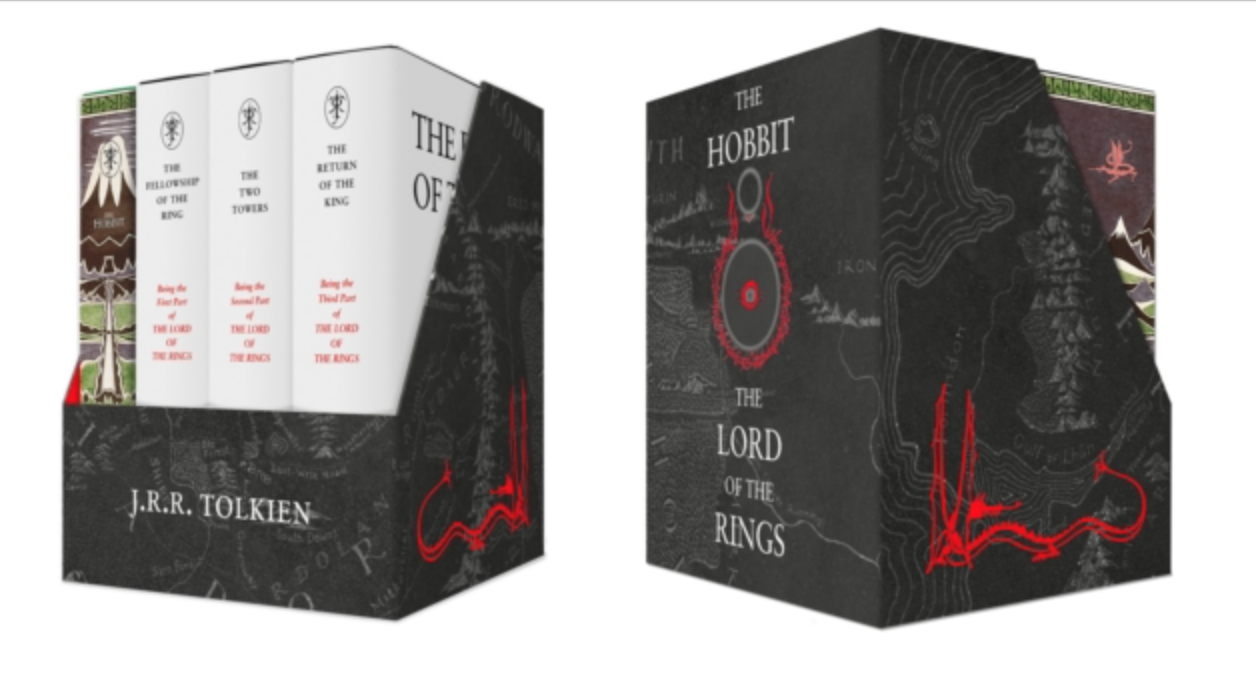
Yeah, Pocket size. I had a semi-informed inkling that these would use the 1st Edition jacket styles.
I'd jave preferred a full-size edition with those jackets, but this is one I will pick up, I think (despite my feelings about the pocket format).
Agree that the box is much too fussy. I think something primarily white, rather than primarily black would work a lot better.
Edit: Speedhyhen has the picture of the back of the box also

I agree. As always, I have an idea of what it SHOULD look like :) Maybe I will fire up the drawing package after I have sorted some thorny database queries this afternoon (having to use SQL Server, and I can't say I like it after 20 years of Oracle and PostgreSQL)
Stu wrote:
I agree. As always, I have an idea of what it SHOULD look like :) Maybe I will fire up the drawing package after I have sorted some thorny database queries this afternoon (having to use SQL Server, and I can't say I like it after 20 years of Oracle and PostgreSQL)
I feel like we have similar design sensiblities :)

23 Jul, 2017
(edited)
2017-7-23 7:13:40 AM UTC
Edited by Stu on 2017-7-23 10:23:49 AM UTC
Edited by Stu on 2017-7-24 3:06:51 AM UTC
Edited by Stu on 2017-7-24 3:06:51 AM UTC
2017-7-23 7:13:40 AM UTC
I think I'd want something more like this (although I'm sure I could do better with a bit of thought). Just nice and simple and true to the original material.

I would prefer this pocket box to fit with the Tolkien Treasury given it also called "Treasury" and have a cover piece from each book, the covers used in the 2005 volumes would work well, I think they would fit more with the Tolkien Treasury covers. Either the towers or the background of Return of the King would fit the Roverandom style on the front. I think the white spines of the Rings volumes are what look out of place.


 3517
3517 1385339