Recommendations for Tolkien facsimile dust jackets
28 Jun, 2014
2014-6-28 11:03:42 AM UTC
2014-6-28 11:03:42 AM UTC
I am looking for companies that can produce exceptional facsimile dust jackets for Tolkien books.
Does anyone have any recommendations?
Does anyone have any recommendations?
Trotter wrote:
I am looking for companies that can produce exceptional facsimile dust jackets for Tolkien books.
Does anyone have any recommendations?
I'm wondering if the best thing is to find a decent local printing firm with good equipment and a good selection of paper stock, and then just build the source file for the jacket yourself (using scans, photos, etc -- as available). I've mulled this over myself a few times, and I think most of the work is in the creation of an accurate electronic representation of the jacket, which may be quite time consuming, depending on what you have to base it on (assuming you don't just have a perfect example to duplicate and need to do some retouching).
I'm working on the assumption that you want to re-jacket rare stuff, rather than books for which facsimile jackets are already readily available?
I used an online service to procure facsimile jackets for a first edition houghton mifflin set of Lord of the Rings. The jackets were not cheap (> $20 apiece), but were good quality reproductions. The vendor can be easily located with google.
Guess answer depends on what you are after as Stu mentioned.
I have always used Mark Terry
http://www.facsimiledustjackets.com/cgi-bin/fdj455/index.html
For first impressions of better know books. choice is limited but quality good and not OTT postage from US to UK.
I did enquire once re getting more unusual copies privately as it were. Firstly you obvious need a good copy to scan and assuming you dont own it that may prove problematic and then of course the costs to print just a few even are high making it in my opinion just not worth it
Which ones are you after?
Having dealt with Mark Terry at Facsimile Dust Jackets L.L.C. I would recommend him if he has the jacket(s) your after. It might be worth enquiring if you don't see the DJ you're after though, as Mark has only a fraction of his scanned jackets up on his site. The last time I emailed him I think he said he had about 35,000-40,000 scanned jackets & only about 8,000-10,000 listed online. He travels the world in search of the best examples to scan, so I've no doubt, if we're talking Tolkien, he's scanned some of the best examples surviving.
I've no real idea of the technical quality of his reproductions (he went into a lot of detail regarding paper stock & scanning & printing technology), but the one I received was excellent. Also worth noting is that his facsimile jackets are marked as such; so they'll not be mistaken for well preserved originals. I liked that he did that, & had done for the very beginning.
BH

6 Jul, 2014
(edited)
2014-7-6 11:10:42 PM UTC
Edited by Stu on 2014-7-7 1:24:59 AM UTC
Edited by Stu on 2014-7-7 3:11:08 AM UTC
Edited by Stu on 2014-7-7 3:16:24 AM UTC
Edited by Stu on 2014-7-7 3:11:08 AM UTC
Edited by Stu on 2014-7-7 3:16:24 AM UTC
2014-7-6 11:10:42 PM UTC
I'm trying to mock up a facsimile DJ for a 4th Impression Hobbit (using various sources) to put on a "beater" ex-libris copy that I picked up for a few bucks. My choice is to get Mark at Facsimile Dust Jackets to resize a 1st imp jacket (which seems like overkill for a tatty old copy) or to have a go at making one myself using elements from other impressions, which has a bit of a fun aspect to it.
I've found a few photos on the internet that tell me most of what I need.
However, can anyone help me with the text that is inside the back flap? I only have a photo that is partially obscured, so I can't make out the text. The front flap isn't a problem - I've figured out the text for that from a similarly obscured picture coupled with the full info gleaned from other impressions.
If anyone knows the correct font for the text (should it even exist in electronic form), that would also be handy. Times New Roman is actually remarkably close, with the chief difference being the "M"s, which do not have slanted sides.
Ta in advance for any help.
Edit: Found what I need in an earlier post by Trotter:
https://www.tolkienguide.com/modules/n ... ewtopic.php?topic_id=1763
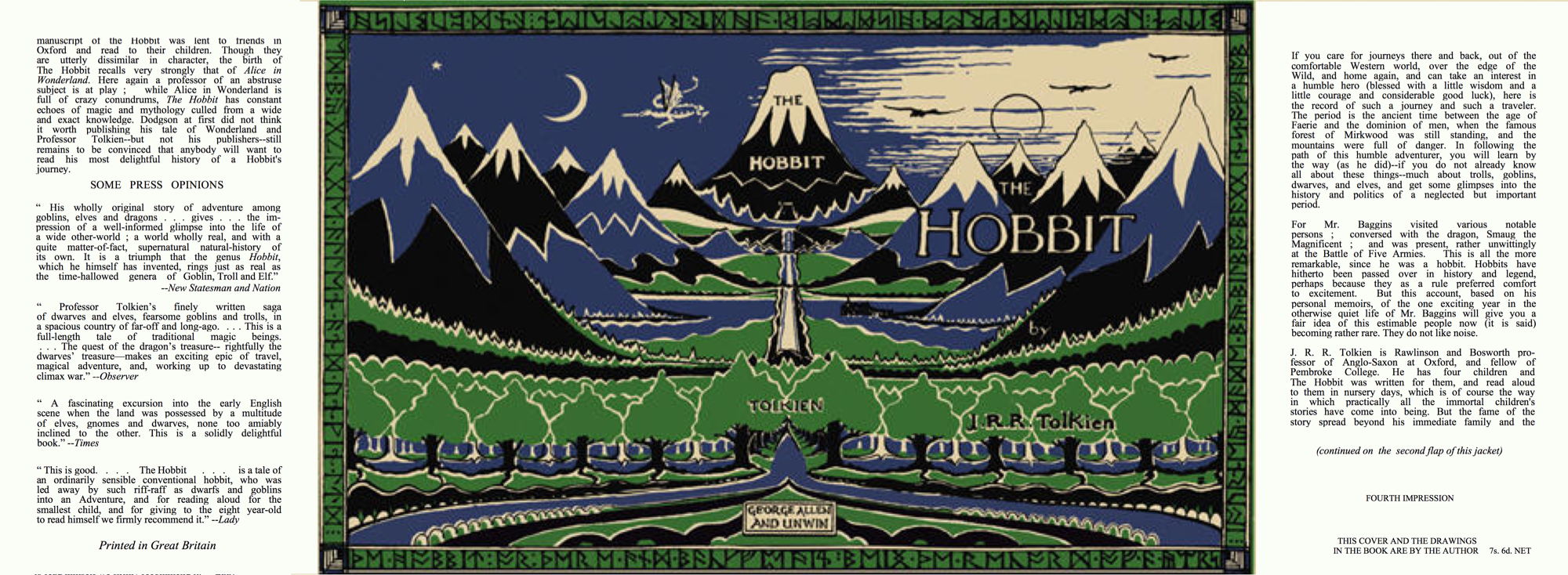
Edit: I figure that it will end up something like this (this is just a low res version for getting the layout right to fit in the book and look vaguely authentic). The exact sizing and spacing of the text will take a bit of mucking about, but it doesn't need to perfect - not like I'm trying to pass it off as real.
I've found a few photos on the internet that tell me most of what I need.
If anyone knows the correct font for the text (should it even exist in electronic form), that would also be handy. Times New Roman is actually remarkably close, with the chief difference being the "M"s, which do not have slanted sides.
Ta in advance for any help.
Edit: Found what I need in an earlier post by Trotter:
https://www.tolkienguide.com/modules/n ... ewtopic.php?topic_id=1763
Edit: I figure that it will end up something like this (this is just a low res version for getting the layout right to fit in the book and look vaguely authentic). The exact sizing and spacing of the text will take a bit of mucking about, but it doesn't need to perfect - not like I'm trying to pass it off as real.
These are scans of my 4th impression dust-wrapper.
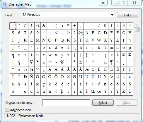
On my Windows computer, I have a font called Perpetua, this seems to be a better than Times New Roman.
On my Windows computer, I have a font called Perpetua, this seems to be a better than Times New Roman.
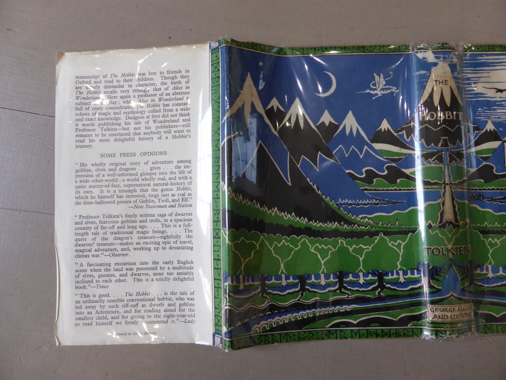
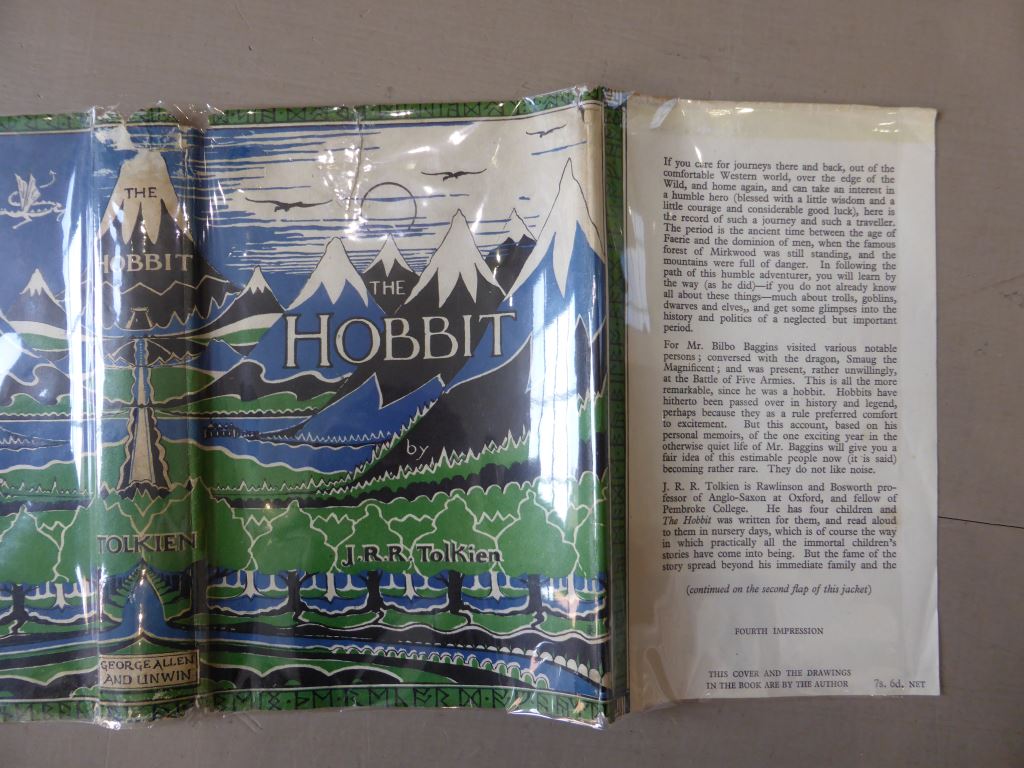
Thanks, Trotter, that is very helpful. I'm currently trying to take a high-res scan of a 1980s A&U DJ (plucked from my shelf) and modify it back into being a reasonable representation of a 1st Ed wrapper. I figure it forces me to improve my graphic skills (which are limited). I'm just moving the main title around and resizing bits and bobs at the moment. I have a lowish res scan of a 1st which I have in a layer underneath to help me get things in the right place and I have "The Art of the Hobbit" to hand as well to snag a couple of bits and bobs from.
Amazing how essentially the same picture changed over the years.
(you are probably wondering why I don't just scan an old wrapper, and the answer is simple - I don't have any early Hobbits! My first Hardback copy came to me new in 1985 and I never purchased any earlier ones (a bit of a mistake with the benefit of hindsight!).

8 Jul, 2014
(edited)
2014-7-8 3:32:19 AM UTC
Edited by Stu on 2014-7-8 5:40:54 AM UTC
Edited by Stu on 2014-7-8 6:05:42 AM UTC
Edited by Stu on 2014-7-8 6:18:37 AM UTC
Edited by Stu on 2014-7-8 6:26:26 AM UTC
Edited by Stu on 2014-7-8 7:08:05 AM UTC
Edited by Stu on 2014-7-8 7:09:16 AM UTC
Edited by Stu on 2014-7-10 3:13:58 AM UTC
Edited by Stu on 2014-7-10 3:14:33 AM UTC
Edited by Stu on 2014-7-10 3:54:51 AM UTC
Edited by Stu on 2014-7-11 12:13:30 AM UTC
Edited by Stu on 2014-7-11 12:14:10 AM UTC
Edited by Stu on 2014-7-11 12:16:14 AM UTC
Edited by Stu on 2014-7-11 12:43:24 PM UTC
Edited by Stu on 2014-7-12 1:39:50 AM UTC
Edited by Stu on 2014-7-13 7:51:52 AM UTC
Edited by Stu on 2014-7-13 7:53:03 AM UTC
Edited by Stu on 2014-7-18 1:36:41 PM UTC
2014-7-8 3:32:19 AM UTC
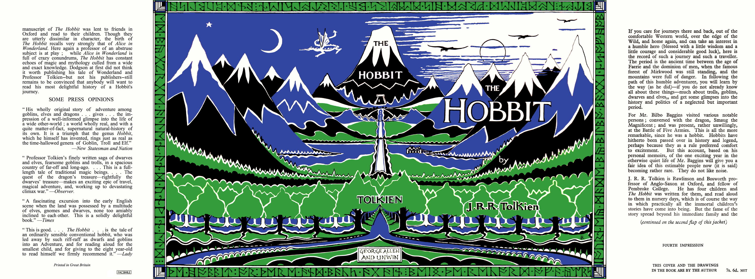
Well, here is a quarter size version of my efforts. I started with my 1985 4th Edition Dust Jacket and worked from there using a low-res scan of a 1937 jacket (as a disposable background layer that I could flick into view to see how things were progressing) coupled with Trotter's photos of his 4th Impression as a guide.
Changes from the initial 1985 Scan ->
Front Cover:
*Moved "HOBBIT" to the right. Repaired Background
*Moved "THE" to the right/up and reduced in size. Repaired Background
*Moved "J. R. R. Tolkien" to the right. Repaired Background
*Adjusted Runes to lower right corner (not sure if this is correct on the 4th impression)
*Adjusted Mountains where white colouring differed
*Adjusted white foam to river
*Added white layer to bottom row of trees (also to rear)
*Added white layer to third row of trees (also to rear)
*Adjusted trees in terms of where white/blue is visible.
*Adjusted clouds to right of "THE"
*Removed/Added white bits all of the place.
*Thinned-out and moved "by" text
(note did not shrink the whole thing vertically and upper right modify clouds -- initially did this, copying the 1937 (which shows more cloud), then realised not required for ’46)
(note 2 did not correct for minor difference at the bottom of the picture above the runes — appears much less significant on the 4th than the 1st)
Spine:
*Moved "H" downward slightly relative to "OBBIT". Increased Size and repositioned.
*Replaced "TOLKIEN" with larger lettering
*Replaced "GA&U" with correct "GEORGE ALLEN AND UNWIN" box
*Replaced several runes at Head of spine (definitely different on the ’37, appear to be different from looking at pictures of the ’46)
*Replaced several runes at Foot of spine (definitely different on the ’37, appear to be different from looking at pictures of the ’46)
All:
*Adjusted Green
*Adjusted Blue
Front Flap:
*Added 1946/4th Text - first three paragraphs from a 1st/4th scan (the front flap is tipped into my copy, so I had a source for this). Impression and cover attribution created manually in MS-Word.
Rear Flap:
*Added 1946/4th Text using a mixture of Times New Roman and Perpetua (Perpetua on its own required too much space between lines, so only used uppercase “M”, "j" and "q" — may revisit this)
Please feel free to point out any errors. Ta :)
Changes from the initial 1985 Scan ->
Front Cover:
*Moved "HOBBIT" to the right. Repaired Background
*Moved "THE" to the right/up and reduced in size. Repaired Background
*Moved "J. R. R. Tolkien" to the right. Repaired Background
*Adjusted Mountains where white colouring differed
*Adjusted white foam to river
*Added white layer to bottom row of trees (also to rear)
*Added white layer to third row of trees (also to rear)
*Adjusted trees in terms of where white/blue is visible.
*Adjusted clouds to right of "THE"
*Removed/Added white bits all of the place.
*Thinned-out and moved "by" text
Spine:
*Moved "H" downward slightly relative to "OBBIT". Increased Size and repositioned.
*Replaced "TOLKIEN" with larger lettering
*Replaced "GA&U" with correct "GEORGE ALLEN AND UNWIN" box
All:
*Adjusted Green
*Adjusted Blue
Front Flap:
*Added 1946/4th Text - first three paragraphs from a 1st/4th scan (the front flap is tipped into my copy, so I had a source for this). Impression and cover attribution created manually in MS-Word.
Rear Flap:
*Added 1946/4th Text using a mixture of Times New Roman and Perpetua (Perpetua on its own required too much space between lines, so only used uppercase “M”, "j" and "q" — may revisit this)
Please feel free to point out any errors. Ta :)





 13
13 1989
1989