
6 Jul, 2014
(edited)
2014-7-6 11:10:42 PM UTC
Edited by Stu on 2014-7-7 1:24:59 AM UTC
Edited by Stu on 2014-7-7 3:11:08 AM UTC
Edited by Stu on 2014-7-7 3:16:24 AM UTC
Edited by Stu on 2014-7-7 3:11:08 AM UTC
Edited by Stu on 2014-7-7 3:16:24 AM UTC
2014-7-6 11:10:42 PM UTC
I'm trying to mock up a facsimile DJ for a 4th Impression Hobbit (using various sources) to put on a "beater" ex-libris copy that I picked up for a few bucks. My choice is to get Mark at Facsimile Dust Jackets to resize a 1st imp jacket (which seems like overkill for a tatty old copy) or to have a go at making one myself using elements from other impressions, which has a bit of a fun aspect to it.
I've found a few photos on the internet that tell me most of what I need.
However, can anyone help me with the text that is inside the back flap? I only have a photo that is partially obscured, so I can't make out the text. The front flap isn't a problem - I've figured out the text for that from a similarly obscured picture coupled with the full info gleaned from other impressions.
If anyone knows the correct font for the text (should it even exist in electronic form), that would also be handy. Times New Roman is actually remarkably close, with the chief difference being the "M"s, which do not have slanted sides.
Ta in advance for any help.
Edit: Found what I need in an earlier post by Trotter:
https://www.tolkienguide.com/modules/n ... ewtopic.php?topic_id=1763
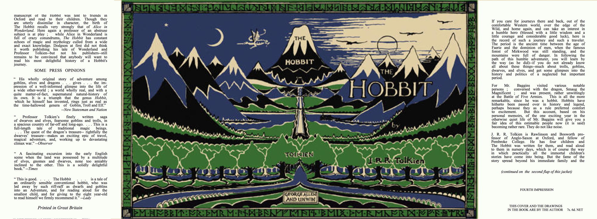
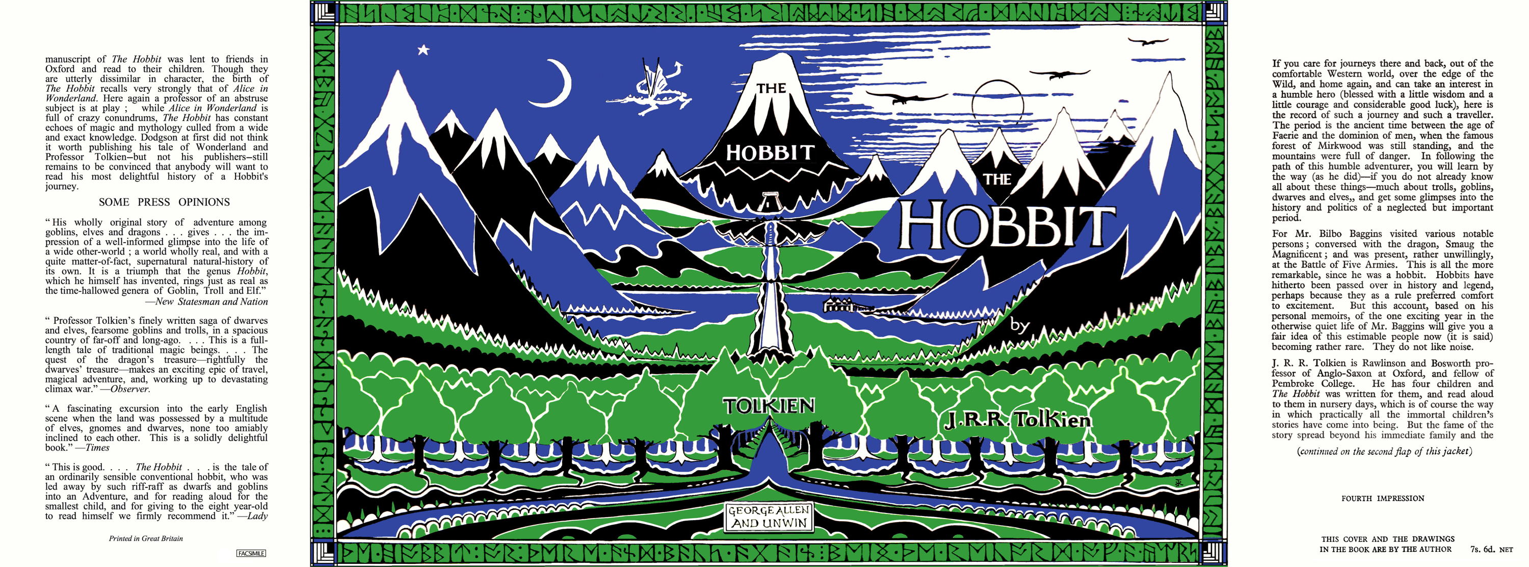
Edit: I figure that it will end up something like this (this is just a low res version for getting the layout right to fit in the book and look vaguely authentic). The exact sizing and spacing of the text will take a bit of mucking about, but it doesn't need to perfect - not like I'm trying to pass it off as real.
I've found a few photos on the internet that tell me most of what I need.
If anyone knows the correct font for the text (should it even exist in electronic form), that would also be handy. Times New Roman is actually remarkably close, with the chief difference being the "M"s, which do not have slanted sides.
Ta in advance for any help.
Edit: Found what I need in an earlier post by Trotter:
https://www.tolkienguide.com/modules/n ... ewtopic.php?topic_id=1763
Edit: I figure that it will end up something like this (this is just a low res version for getting the layout right to fit in the book and look vaguely authentic). The exact sizing and spacing of the text will take a bit of mucking about, but it doesn't need to perfect - not like I'm trying to pass it off as real.
These are scans of my 4th impression dust-wrapper.
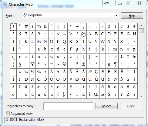
On my Windows computer, I have a font called Perpetua, this seems to be a better than Times New Roman.
On my Windows computer, I have a font called Perpetua, this seems to be a better than Times New Roman.
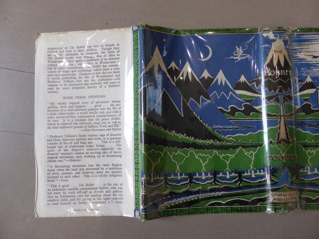
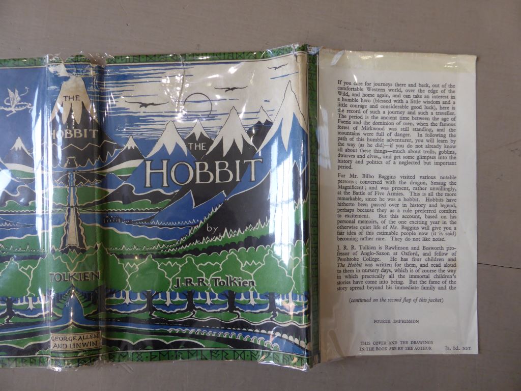
Thanks, Trotter, that is very helpful. I'm currently trying to take a high-res scan of a 1980s A&U DJ (plucked from my shelf) and modify it back into being a reasonable representation of a 1st Ed wrapper. I figure it forces me to improve my graphic skills (which are limited). I'm just moving the main title around and resizing bits and bobs at the moment. I have a lowish res scan of a 1st which I have in a layer underneath to help me get things in the right place and I have "The Art of the Hobbit" to hand as well to snag a couple of bits and bobs from.
Amazing how essentially the same picture changed over the years.
(you are probably wondering why I don't just scan an old wrapper, and the answer is simple - I don't have any early Hobbits! My first Hardback copy came to me new in 1985 and I never purchased any earlier ones (a bit of a mistake with the benefit of hindsight!).

8 Jul, 2014
(edited)
2014-7-8 3:32:19 AM UTC
Edited by Stu on 2014-7-8 5:40:54 AM UTC
Edited by Stu on 2014-7-8 6:05:42 AM UTC
Edited by Stu on 2014-7-8 6:18:37 AM UTC
Edited by Stu on 2014-7-8 6:26:26 AM UTC
Edited by Stu on 2014-7-8 7:08:05 AM UTC
Edited by Stu on 2014-7-8 7:09:16 AM UTC
Edited by Stu on 2014-7-10 3:13:58 AM UTC
Edited by Stu on 2014-7-10 3:14:33 AM UTC
Edited by Stu on 2014-7-10 3:54:51 AM UTC
Edited by Stu on 2014-7-11 12:13:30 AM UTC
Edited by Stu on 2014-7-11 12:14:10 AM UTC
Edited by Stu on 2014-7-11 12:16:14 AM UTC
Edited by Stu on 2014-7-11 12:43:24 PM UTC
Edited by Stu on 2014-7-12 1:39:50 AM UTC
Edited by Stu on 2014-7-13 7:51:52 AM UTC
Edited by Stu on 2014-7-13 7:53:03 AM UTC
Edited by Stu on 2014-7-18 1:36:41 PM UTC
2014-7-8 3:32:19 AM UTC
Well, here is a quarter size version of my efforts. I started with my 1985 4th Edition Dust Jacket and worked from there using a low-res scan of a 1937 jacket (as a disposable background layer that I could flick into view to see how things were progressing) coupled with Trotter's photos of his 4th Impression as a guide.
Changes from the initial 1985 Scan ->
Front Cover:
*Moved "HOBBIT" to the right. Repaired Background
*Moved "THE" to the right/up and reduced in size. Repaired Background
*Moved "J. R. R. Tolkien" to the right. Repaired Background
*Adjusted Runes to lower right corner (not sure if this is correct on the 4th impression)
*Adjusted Mountains where white colouring differed
*Adjusted white foam to river
*Added white layer to bottom row of trees (also to rear)
*Added white layer to third row of trees (also to rear)
*Adjusted trees in terms of where white/blue is visible.
*Adjusted clouds to right of "THE"
*Removed/Added white bits all of the place.
*Thinned-out and moved "by" text
(note did not shrink the whole thing vertically and upper right modify clouds -- initially did this, copying the 1937 (which shows more cloud), then realised not required for ’46)
(note 2 did not correct for minor difference at the bottom of the picture above the runes — appears much less significant on the 4th than the 1st)
Spine:
*Moved "H" downward slightly relative to "OBBIT". Increased Size and repositioned.
*Replaced "TOLKIEN" with larger lettering
*Replaced "GA&U" with correct "GEORGE ALLEN AND UNWIN" box
*Replaced several runes at Head of spine (definitely different on the ’37, appear to be different from looking at pictures of the ’46)
*Replaced several runes at Foot of spine (definitely different on the ’37, appear to be different from looking at pictures of the ’46)
All:
*Adjusted Green
*Adjusted Blue
Front Flap:
*Added 1946/4th Text - first three paragraphs from a 1st/4th scan (the front flap is tipped into my copy, so I had a source for this). Impression and cover attribution created manually in MS-Word.
Rear Flap:
*Added 1946/4th Text using a mixture of Times New Roman and Perpetua (Perpetua on its own required too much space between lines, so only used uppercase “M”, "j" and "q" — may revisit this)
Please feel free to point out any errors. Ta :)
Changes from the initial 1985 Scan ->
Front Cover:
*Moved "HOBBIT" to the right. Repaired Background
*Moved "THE" to the right/up and reduced in size. Repaired Background
*Moved "J. R. R. Tolkien" to the right. Repaired Background
*Adjusted Mountains where white colouring differed
*Adjusted white foam to river
*Added white layer to bottom row of trees (also to rear)
*Added white layer to third row of trees (also to rear)
*Adjusted trees in terms of where white/blue is visible.
*Adjusted clouds to right of "THE"
*Removed/Added white bits all of the place.
*Thinned-out and moved "by" text
Spine:
*Moved "H" downward slightly relative to "OBBIT". Increased Size and repositioned.
*Replaced "TOLKIEN" with larger lettering
*Replaced "GA&U" with correct "GEORGE ALLEN AND UNWIN" box
All:
*Adjusted Green
*Adjusted Blue
Front Flap:
*Added 1946/4th Text - first three paragraphs from a 1st/4th scan (the front flap is tipped into my copy, so I had a source for this). Impression and cover attribution created manually in MS-Word.
Rear Flap:
*Added 1946/4th Text using a mixture of Times New Roman and Perpetua (Perpetua on its own required too much space between lines, so only used uppercase “M”, "j" and "q" — may revisit this)
Please feel free to point out any errors. Ta :)
Mark Terry will be recreating both the first and second facsimile Hobbit dust jackets to correct the problem with the runes that have been discovered.
It does appear to affect every copy that he has sold to date.
If you have a facsimile dust jacket and want to check them it is easy to do so, by looking at the lower right hand corner at the images below.
It does appear to affect every copy that he has sold to date.
If you have a facsimile dust jacket and want to check them it is easy to do so, by looking at the lower right hand corner at the images below.
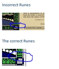
Probably worth mentioning as well that Mark is not the only supplier of jackets that are incorrect, as it seems that there may have been some re-scanning of the bad facsimiles in order to create new ones. If you are in the market for a jacket from *any supplier of jackets* you need to check the runes in the bottom right and/or directly above and below the spine. These will be completely different from that of a legit UK jacket.
There are several other faults on the jackets (such as the sizing of spine text, the cutoff point of the main image, noticeable on the clouds at the top right of the front, the cutoff point of the picture at the bottom), but these are the dead obvious* ones.
(* So dead obvious that I initially tried to copy them when creating my jacket! Thanks to Trotter for setting me straight as to what was right/wrong when I brought the differences to his attention).

10 Jul, 2014
(edited)
2014-7-10 3:19:07 AM UTC
Edited by Stu on 2014-7-10 3:40:55 AM UTC
Edited by Stu on 2014-7-10 3:56:54 AM UTC
Edited by Stu on 2014-7-12 1:38:07 AM UTC
Edited by Stu on 2014-7-10 3:56:54 AM UTC
Edited by Stu on 2014-7-12 1:38:07 AM UTC
2014-7-10 3:19:07 AM UTC
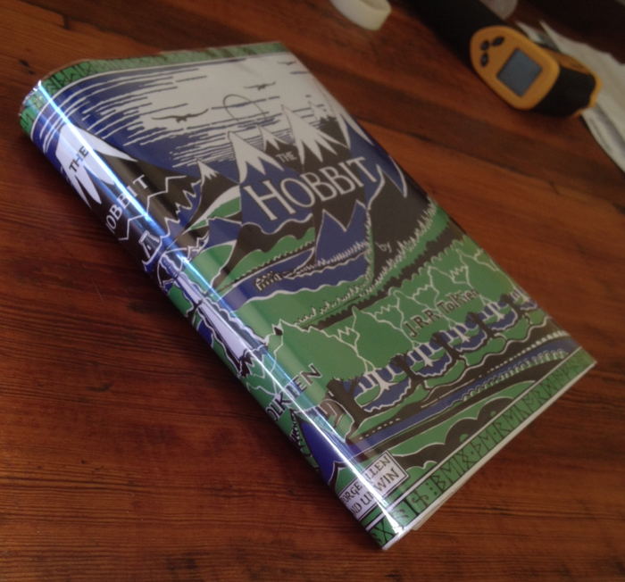
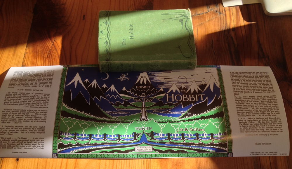
Well, 25+ hours of photoshopping and I ended up with something I was happy enough with. Anyone contemplating of converting a 4th Ed Jacket into a 1st, my advice would be -- don't!! Start with a 3rd Edition as there are an order of magnitude less changes required.
The local print place ran it off for me on semi-gloss paper on their wide printer for $15 and I'm very pleased with the result. $65 all in for a 1st/4th in a correct impression facsimile Dust jacket feels like decent enough value. If I was going to print it again, I'd probably enlarge it by 1.5mm vertically to lose the white bands top and bottom, which seem to be cut off on the original (as presumably the original jacket printing was a tiny bit too big for the book). I'd also adjust the blue a bit further and change to CYMK to get a bit more colour accuracy from the print place.
If anyone wants the 300dpi file for the jacket, it is a about 7Mb, so just drop me a PM with your email address.
Thanks to Trotter for his assistance with this little project.
(Note the pictures don't show the final version -- I did another 10 hours or so of editing after I printed it....)

11 Jul, 2014
(edited)
2014-7-11 5:19:45 PM UTC
Edited by Trotter on 2014-7-11 5:30:36 PM UTC
Edited by Trotter on 2014-7-11 5:31:44 PM UTC
Edited by Trotter on 2014-7-11 5:38:37 PM UTC
Edited by Trotter on 2014-7-11 5:31:44 PM UTC
Edited by Trotter on 2014-7-11 5:38:37 PM UTC
2014-7-11 5:19:45 PM UTC
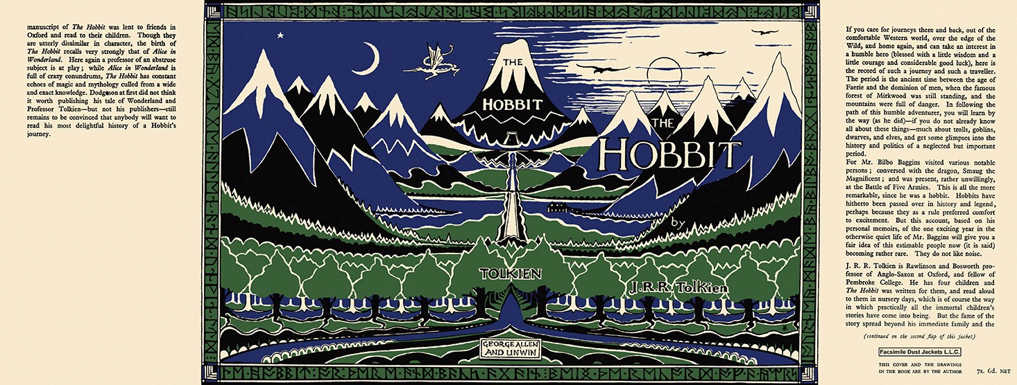
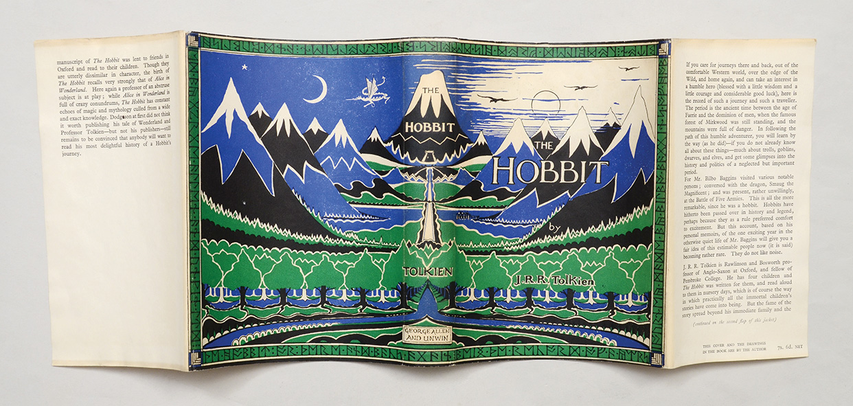
Mark Terry from Facsimile Dust Jackets L.L.C. (http://www.facsimiledustjackets.com/cgi-bin/fdj455/index.html) has updated his 1937 UK Hobbit facsimile dust jackets, but not the pictures on the website yet.
This is the new version, scanned from an original dust jacket, also shown below, for sale at a ridiculously stupid price from Peter Harrington (£100000).
http://www.peterharrington.co.uk/rare ... r-there-and-back-again-7/
The colour reproduction is not exactly the same, but I actually prefer the darker blue and green, as these are closer to Tolkien's original drawing for the dust jacket.

12 Jul, 2014
(edited)
2014-7-12 1:57:34 AM UTC
Edited by Stu on 2014-7-12 10:40:41 AM UTC
Edited by Stu on 2014-7-13 7:49:36 AM UTC
Edited by Stu on 2014-7-13 10:21:06 AM UTC
Edited by Stu on 2014-7-13 10:23:14 AM UTC
Edited by Stu on 2014-7-13 11:56:18 AM UTC
Edited by Stu on 2014-7-18 1:35:14 PM UTC
Edited by Stu on 2014-7-19 1:01:15 AM UTC
Edited by Stu on 2016-3-17 4:53:21 AM UTC
Edited by Stu on 2016-3-17 5:00:22 AM UTC
Edited by Stu on 2016-3-24 1:21:05 AM UTC
Edited by Stu on 2016-3-24 1:23:33 AM UTC
2014-7-12 1:57:34 AM UTC
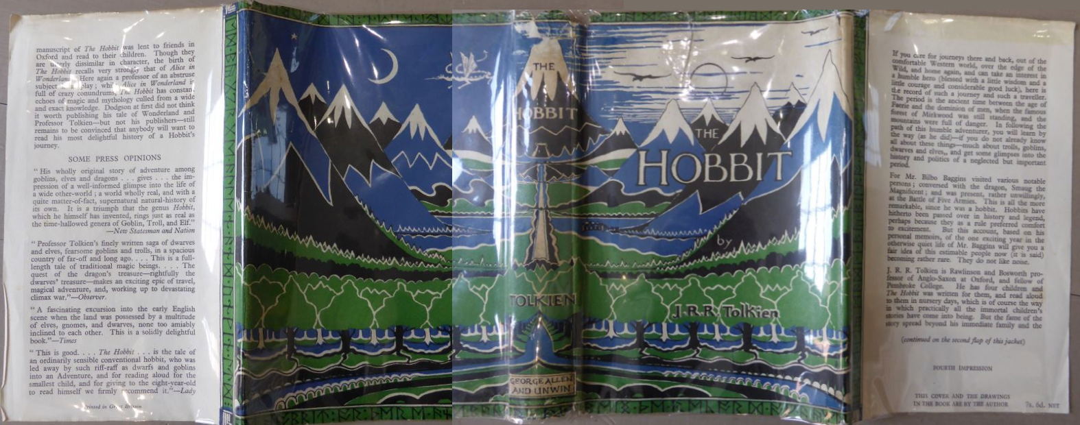
Here are the 4th Impression versions in low res. My final (which has been refined a lot since I printed my copy -- I might reprint on the correct type of paper stock at some point when I am in a decent sized city or I visit a first world country) and Trotter's genuine copy.
If you compare the originals between the 1st impression and the 4th, a LOT of differences (and I'm not just talking about the text on the flaps). I think most of the differences come out of the alignment of the plates when printing the three colours (with the white obviously being the paper showing through). The white layer between the feet of the front row of trees shows clearly the kinds of difference between the impressions, in case anyone is interested. I didn't get that layer quite thick enough on my version, but my journey into the heart of darkness is complete, so it will have to do!
[Edit 17/03/16. As an endless tinkerer, I reset the front flap yet again, adjusting the interline spacing, changing the uppercase "W" characters, fixing a missing "-", swapping an inverted comma to the correct type and increasing the boldness a tad]
[Edit 24/03/16. Image Removed to prevent illicit printing -- will replace with even lower-res version when I have time]
If you compare the originals between the 1st impression and the 4th, a LOT of differences (and I'm not just talking about the text on the flaps). I think most of the differences come out of the alignment of the plates when printing the three colours (with the white obviously being the paper showing through). The white layer between the feet of the front row of trees shows clearly the kinds of difference between the impressions, in case anyone is interested.
[Edit 17/03/16. As an endless tinkerer, I reset the front flap yet again, adjusting the interline spacing, changing the uppercase "W" characters, fixing a missing "-", swapping an inverted comma to the correct type and increasing the boldness a tad]
[Edit 24/03/16. Image Removed to prevent illicit printing -- will replace with even lower-res version when I have time]





 9
9 1639
1639