The changes may be a result of the size of the dust jacket changing between the 1/1st, 1/2nd and later printings, but also the printer changed.
A company called FGS printed the first two impressions and then J. Howell for the later printings.
In Deagol's article, I cannot see anymore about FGS or what the initials mean?
Does anyone know?
http://www.tolkienbooks.net/php/earlyhobbits.php
A company called FGS printed the first two impressions and then J. Howell for the later printings.
In Deagol's article, I cannot see anymore about FGS or what the initials mean?
Does anyone know?
http://www.tolkienbooks.net/php/earlyhobbits.php
You may notice what looks like a mistake on Stu's facsimile dust jacket.
The word 'elves', on the front-flap of the dust wrapper, has two commas after it, instead of one.
This does appear on the 1946 dust jacket, it is not present on the 1942 or 1951 dust jackets, and indicates that the text for the 1946 dust jacket was probably reset, and this error occurred as part of the reset.
It was spotted and corrected for the second edition in 1951.
This is so far the only difference that I am aware of between the 1942 and 1946 Hobbits, the two differences mentioned in the Descriptive Bibliography (page 16), actually occur between the second and third impressions.
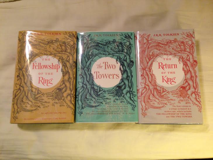
I used Mark Terry at Facsimile Dust Jackets L.L.C. for my US set of LOTR dust jackets and I could not be happier. I would recommend him.
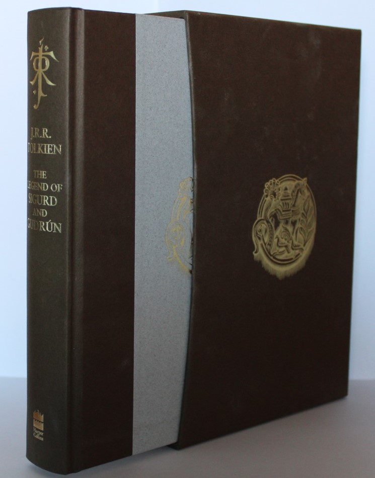
Does anyone know where to buy nice cheap slipcases?
Does anyone know where to buy nice cheap slipcases?

You might try Tolkien Bookshelf. I have one. Good quality.

9 Dec, 2015
(edited)
2015-12-9 10:08:34 PM UTC
Edited by Stu on 2015-12-10 7:43:01 AM UTC
Edited by Stu on 2015-12-10 7:44:09 AM UTC
Edited by Stu on 2015-12-12 6:22:48 AM UTC
Edited by Stu on 2015-12-12 6:29:53 AM UTC
Edited by Stu on 2015-12-12 8:49:59 AM UTC
Edited by Stu on 2015-12-12 8:58:17 AM UTC
Edited by Stu on 2015-12-13 4:46:01 AM UTC
Edited by Stu on 2015-12-13 4:47:46 AM UTC
Edited by Stu on 2015-12-13 5:25:11 AM UTC
Edited by Stu on 2015-12-13 5:25:41 AM UTC
Edited by Stu on 2015-12-13 5:29:32 AM UTC
Edited by Stu on 2015-12-13 5:32:37 AM UTC
Edited by Stu on 2015-12-13 11:55:19 PM UTC
Edited by Stu on 2015-12-14 12:01:07 AM UTC
Edited by Stu on 2015-12-14 5:25:43 AM UTC
Edited by Stu on 2015-12-14 5:27:23 AM UTC
Edited by Stu on 2016-3-17 5:05:23 AM UTC
Edited by Stu on 2016-3-17 5:06:06 AM UTC
Edited by Stu on 2016-3-24 1:21:38 AM UTC
Edited by Stu on 2016-3-24 1:24:09 AM UTC
2015-12-9 10:08:34 PM UTC
Just in case anyone is interested in the contents of the 5th impression or 6th impression jackets, I knocked up reproductions (initially to waste time waiting for an MRI scan that I was very early for, followed by an evening wasted to finish 'em up). Low res-versions below (open in another tab to see at more readable size).
Note that the jacket text has been typeset in MS-Word from photographs (mostly), rather than being scanned. Useful to see the progressive changes in text from the 4th onward (in the 5th, Tolkien's job changes and mention of Dodgson is dropped), and then on the 6th, the LOTR preview information is added, and all the prior front-flap information is ditched.
The main font is Times New Roman, upper case "W" is Bodoni 72 Book, lower case italic "w" is Bell MT, upper Case "M" is Iowan Old Style. The characters '8', '9' and '6' are Athelas.
edit: Fixed error pointed out by Trotter
edit: 1st - 10th (except 3rd, which is essentially just like 4th)
[Edit 24/03/16. Images Removed to prevent illicit printing -- will replace with even lower-res versions when I have time]
Trotter wrote:
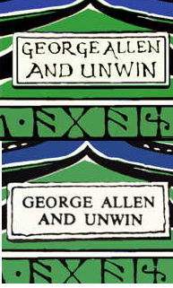
The fifth Impression should have a hand written George Allen & Unwin as on my avatar.
Thanks for that - I'll change it back! I didn't have a spine picture of the 5th, and for some reason I thought that was the first impression that switched over to the later version.
Lets have some theories, why was Tolkien's Dust-Jacket changed in the 1954 printing of the The Hobbit, UK George Allen & Unwin, to have a type-written George Allen and Unwin on the spine?
I am a huge fan of Tolkien's hand-written version on the first five UK hardback impressions :) but does anyone know why it was changed?
If not then am very open to why you think they changed it and do you think the typed version is an improvement?
I am a huge fan of Tolkien's hand-written version on the first five UK hardback impressions :) but does anyone know why it was changed?
If not then am very open to why you think they changed it and do you think the typed version is an improvement?

Trotter wrote:
Lets have some theories, why was Tolkien's Dust-Jacket changed in the 1954 printing of the The Hobbit, UK George Allen & Unwin, to have a type-written George Allen and Unwin on the spine?
I am a huge fan of Tolkien's hand-written version on the first five UK hardback impressions :) but does anyone know why it was changed?
If not then am very open to why you think they changed it and do you think the typed version is an improvement?
My only theory would be to do with corporate identity -- if perhaps they were moving towards a standard typeface for the spine logo on all their books. I can't see any evidence of this, doing a search on Abe and trying to look at some other spines from the era, though.
I think the earlier version has its charm, but the later version probably looks a bit neater. It's good that we have both -- it makes the earlier impressions that bit more unique.
Edit: I wonder if it was nothing more than to be more cohesive with the upcoming LOTR Dustjackets, given the 6th was the first to mention LOTR in preparation?


 48
48 5407
5407