


General Topics >> 2024 Lord of the Rings 70th Anniversary Deluxe Edition Unboxing - Tuesday September 24th


16 Oct, 2025
(edited)
2025-10-16 11:25:43 AM UTC
Edited by rosshm16 on 2025-10-16 11:26:11 AM UTC
2025-10-16 11:25:43 AM UTC
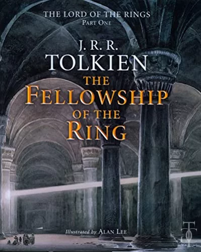
Here is the "Bilbo in Rivendell" illustration from the 1st (top photo) and 2nd (bottom photo) printings, William Morrow edition.
The apparent difference in coloring is just different lighting conditions where I took the photos, the coloring is ~ the same in both.
I see some small white spots in the 1st printing that are not evident in the 2nd printing, and also some other small white dots in the 2nd printing that were not evident in the 1st printing.

16 Oct, 2025
(edited)
2025-10-16 8:03:06 PM UTC
Edited by The late Stu on 2025-10-16 8:03:41 PM UTC
Edited by The late Stu on 2025-10-16 8:07:00 PM UTC
Edited by The late Stu on 2025-10-16 8:07:00 PM UTC
2025-10-16 8:03:06 PM UTC
This is the first impression HarperCollins speckling on my copy. I recall at the time that some copies were much worse than mine (I wasn't bothered at all, given it was limited to this one illustration and I have better versions of it, but I did see some photos where it looked fairly bad)
Yikes at the half-toning though. Such mediocre print technology. Part of the problem I have with these recent(ish) releases is the obvious halftones that can be seen clearly with the naked eye. My reading glasses are a curse!
Yikes at the half-toning though. Such mediocre print technology. Part of the problem I have with these recent(ish) releases is the obvious halftones that can be seen clearly with the naked eye. My reading glasses are a curse!
 1
1