Tolkien Collector's Guide
Sign In
Tolkien Collector's Guide
Important links:

Guide to Tolkien's Letters
-
Winner of the 2019 Tolkien Society award for Best Website

Comparison of Tolkien illustrated Deluxe LotR with Contributor's Edition

12 Nov, 2021
2021-11-12 4:16:43 PM UTC

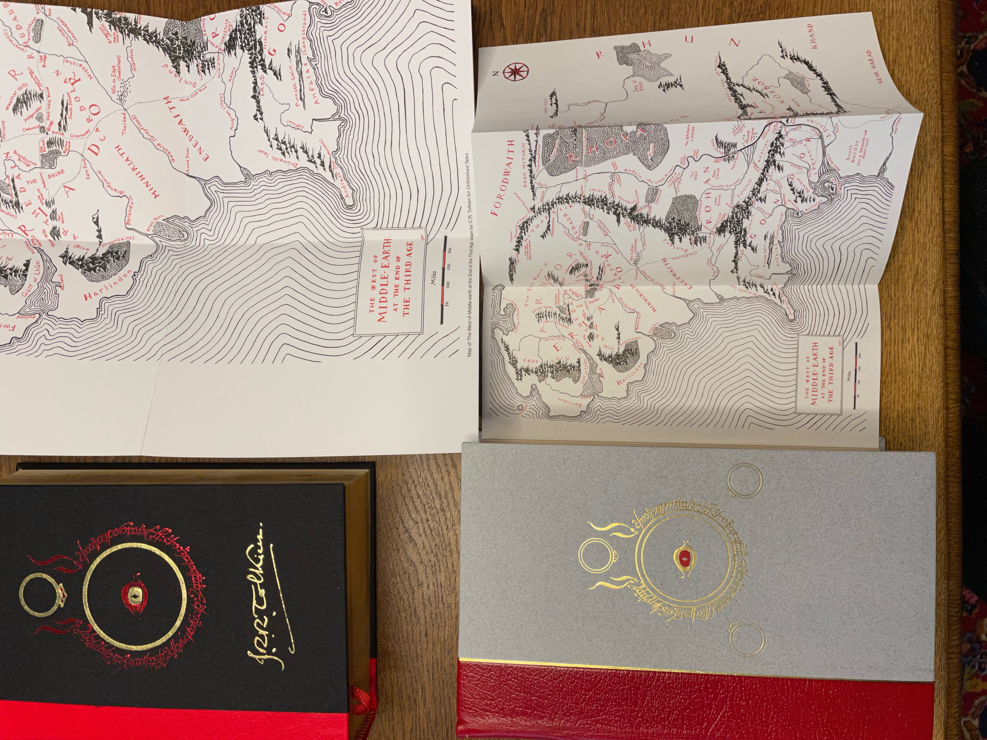
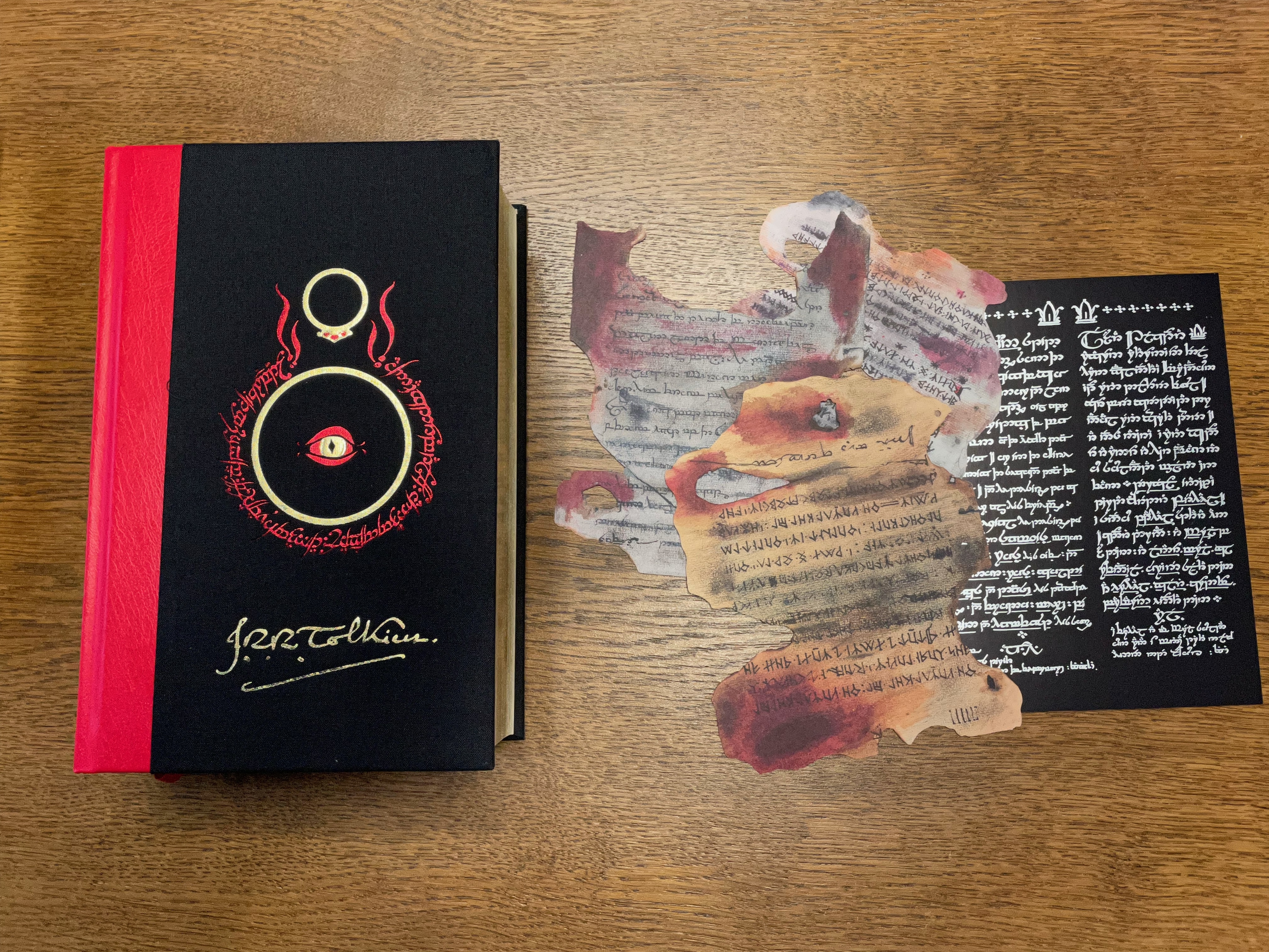
Finally I've got a copy of the new Tolkien illustrated deluxe edition. This here is a comparison with its twin, the contributor's edition, which has been produced for all those who worked on the 50th anniversary edition of the book.

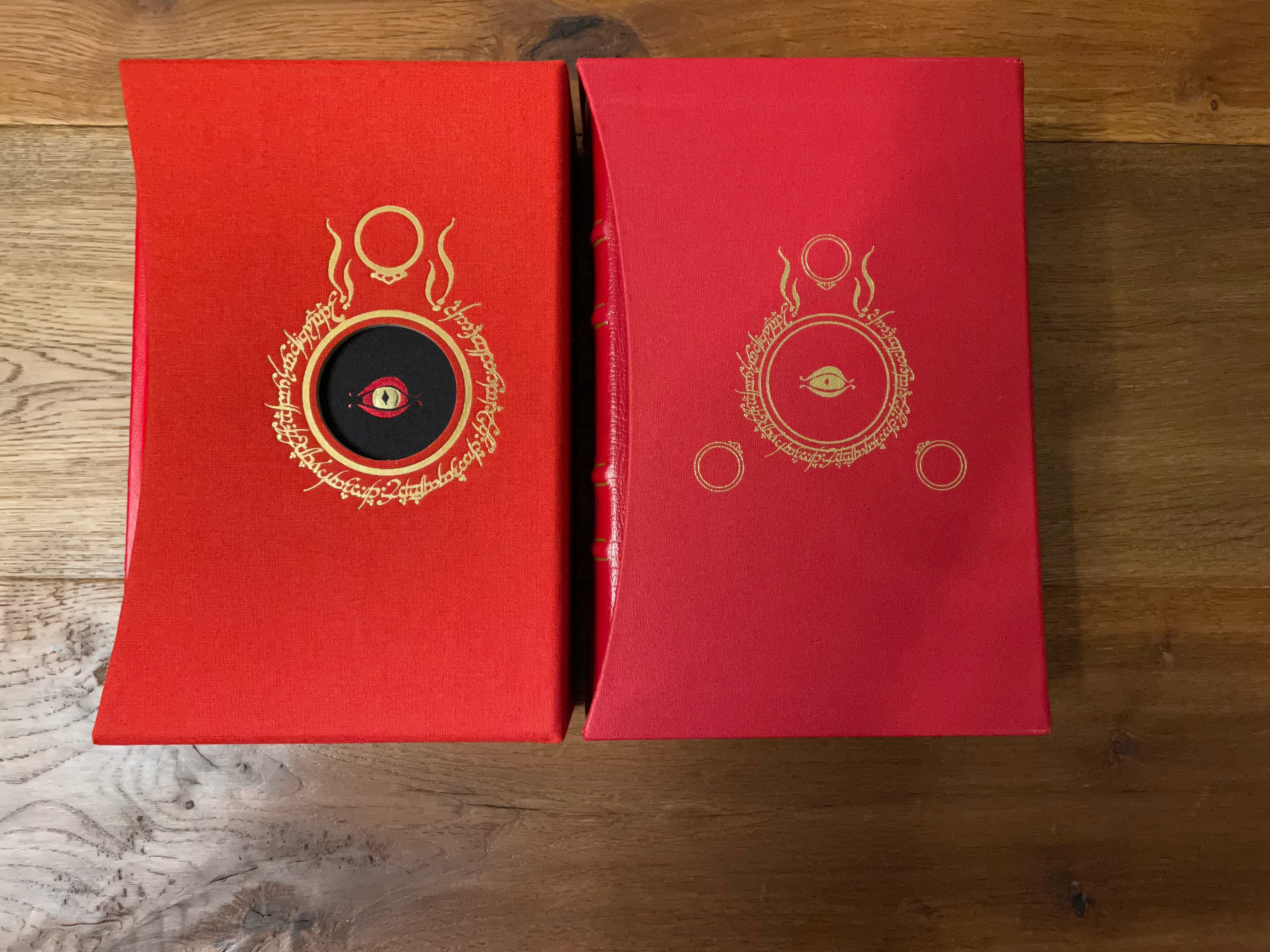
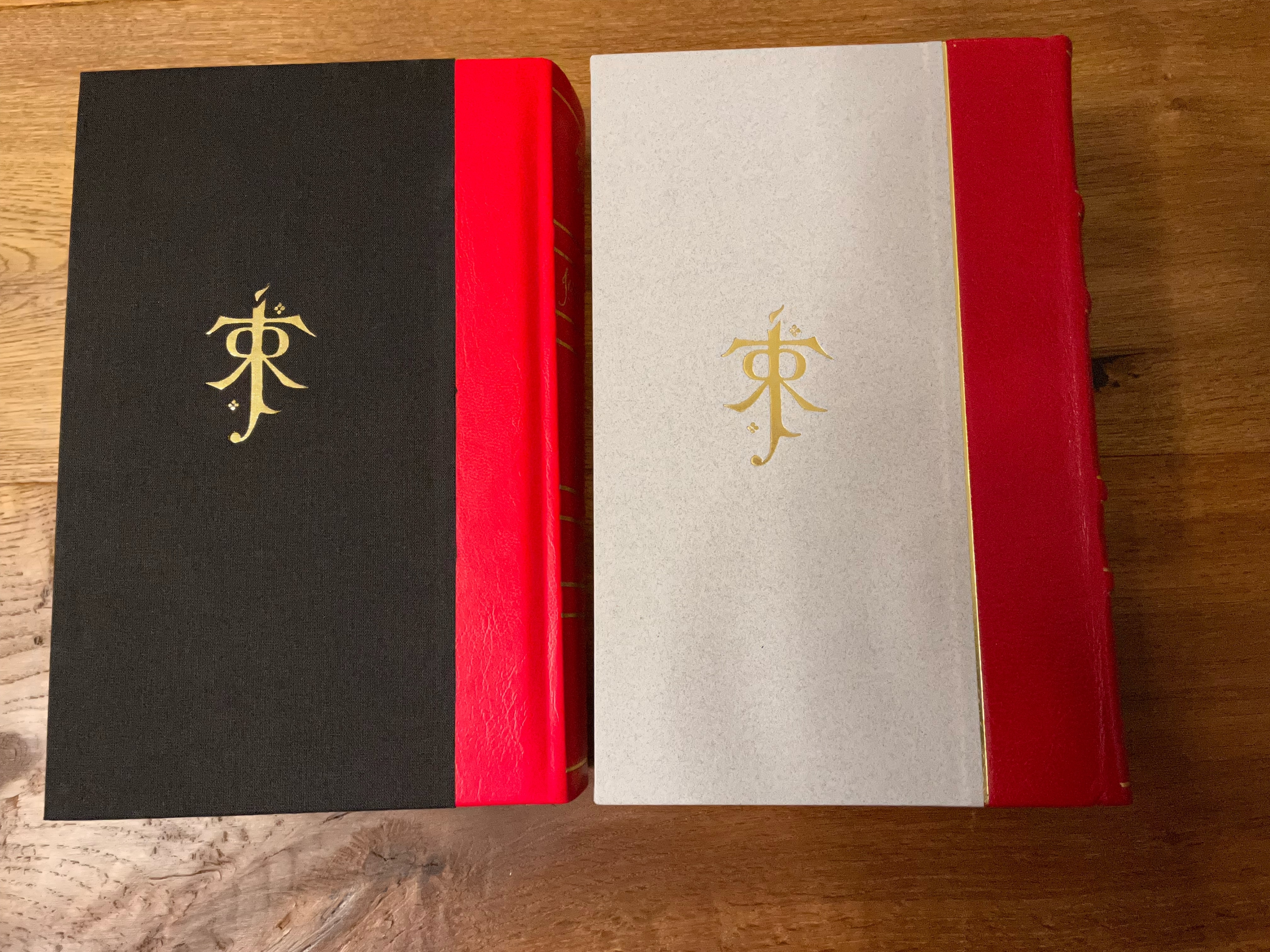
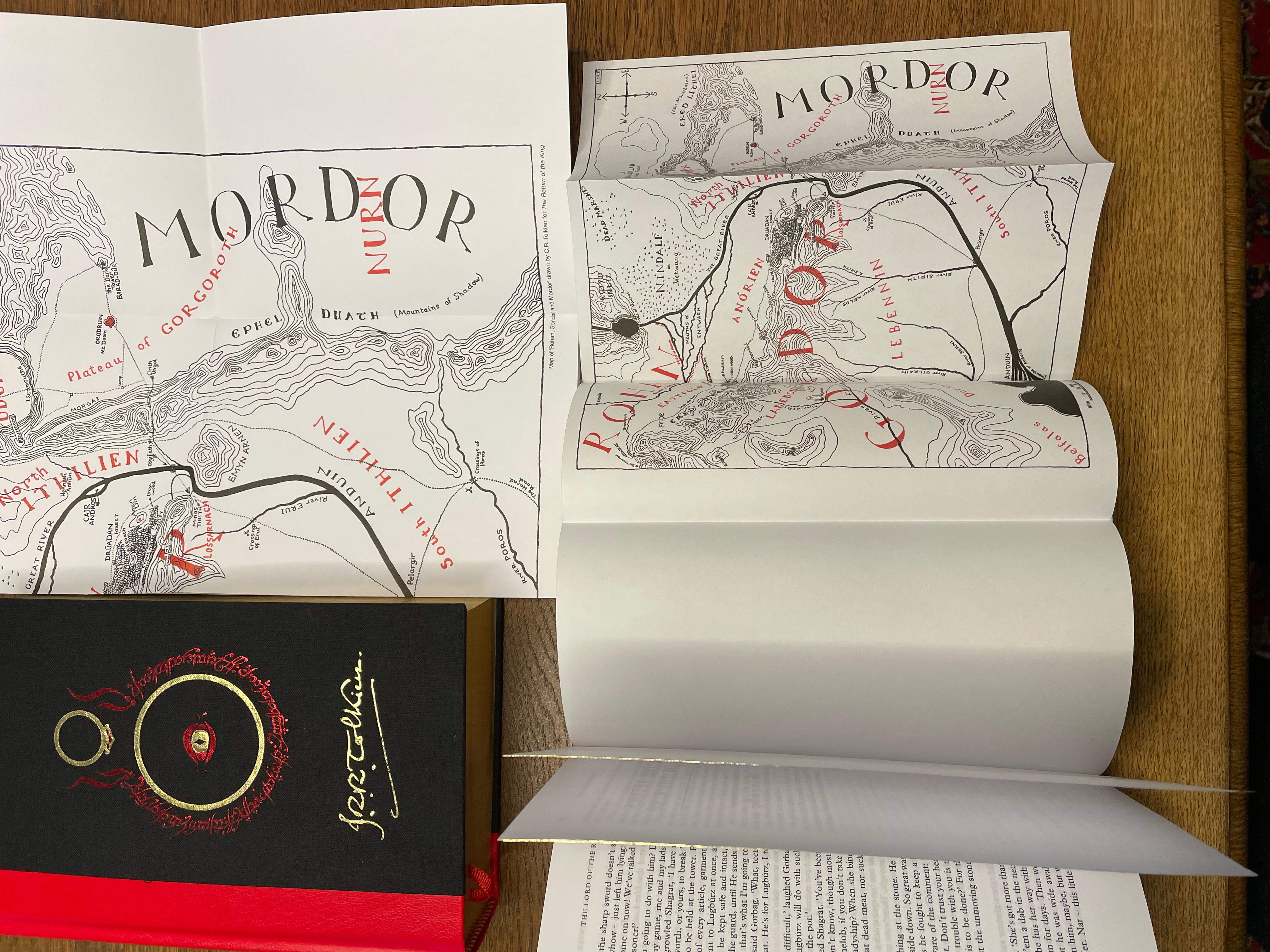
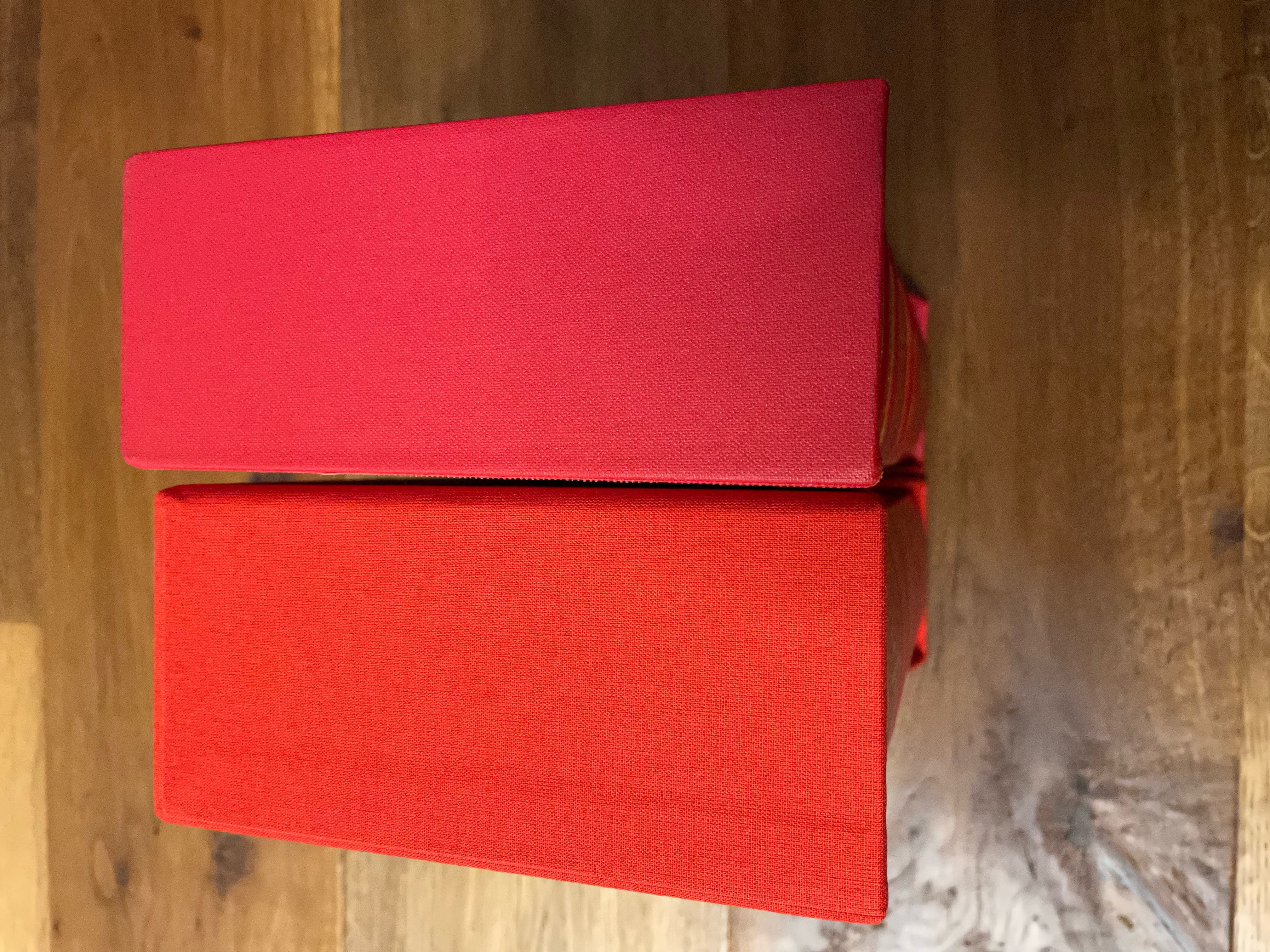
Both editions are housing in slipcases. The new one is cloth covered and has a hole to visualise Sauron's eye from the cover of the book. The ring inscription is flanked only by the ring of Gandalf. The used carton is thicker and more sturdier than that used for the contributor's edition. The latter is covered by buckram and the ring symbol flanked by all three elven rings.
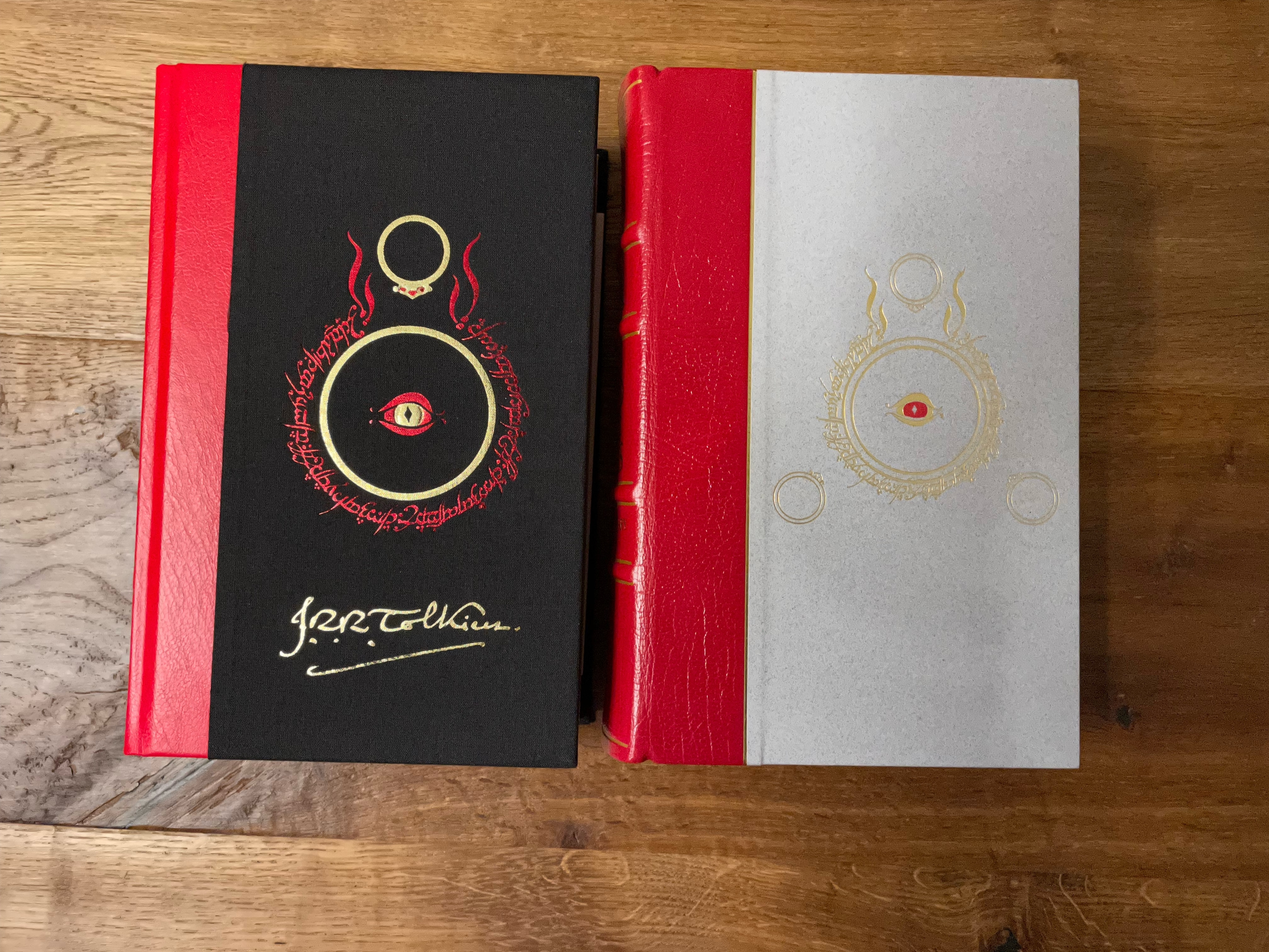
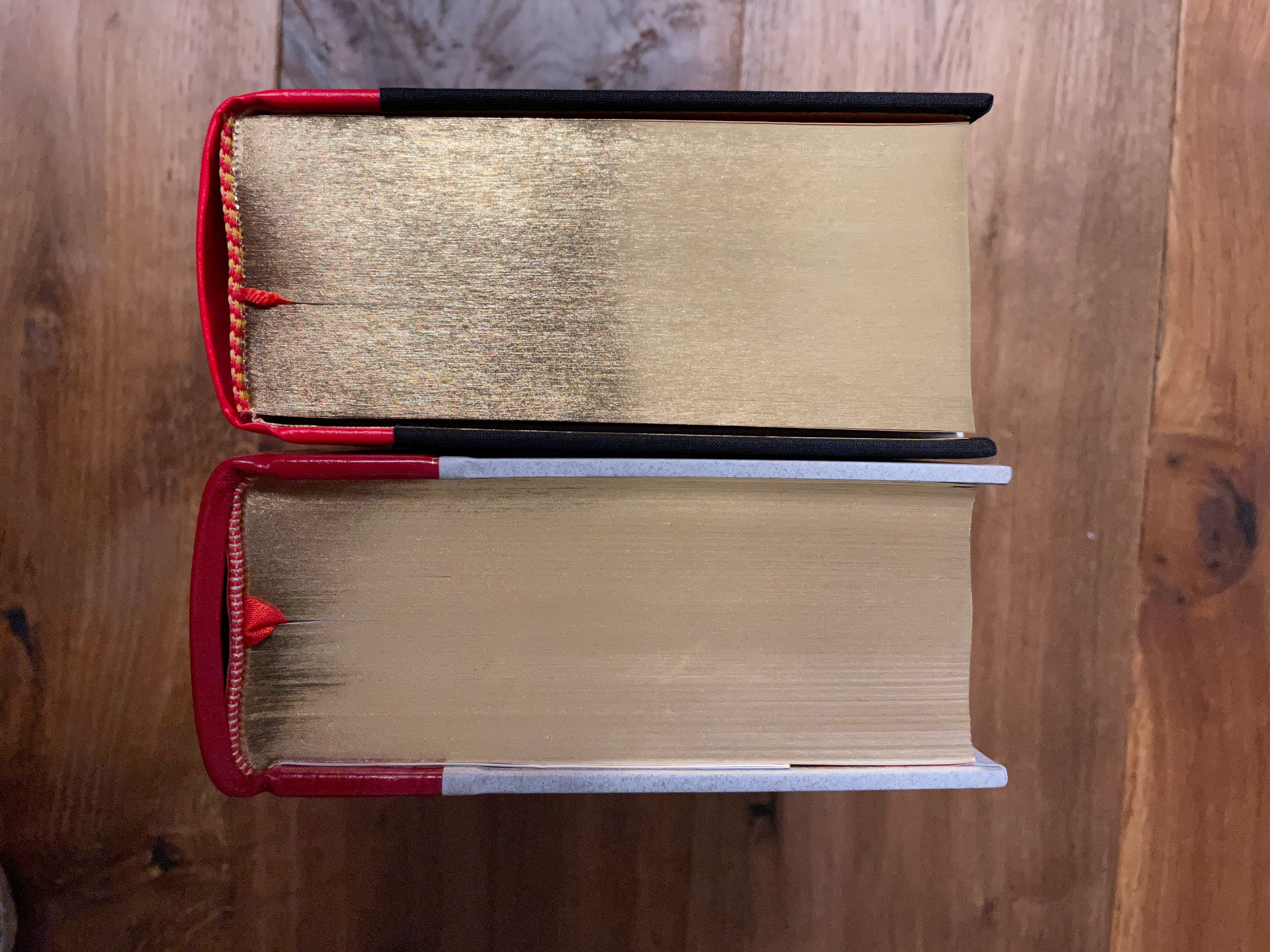
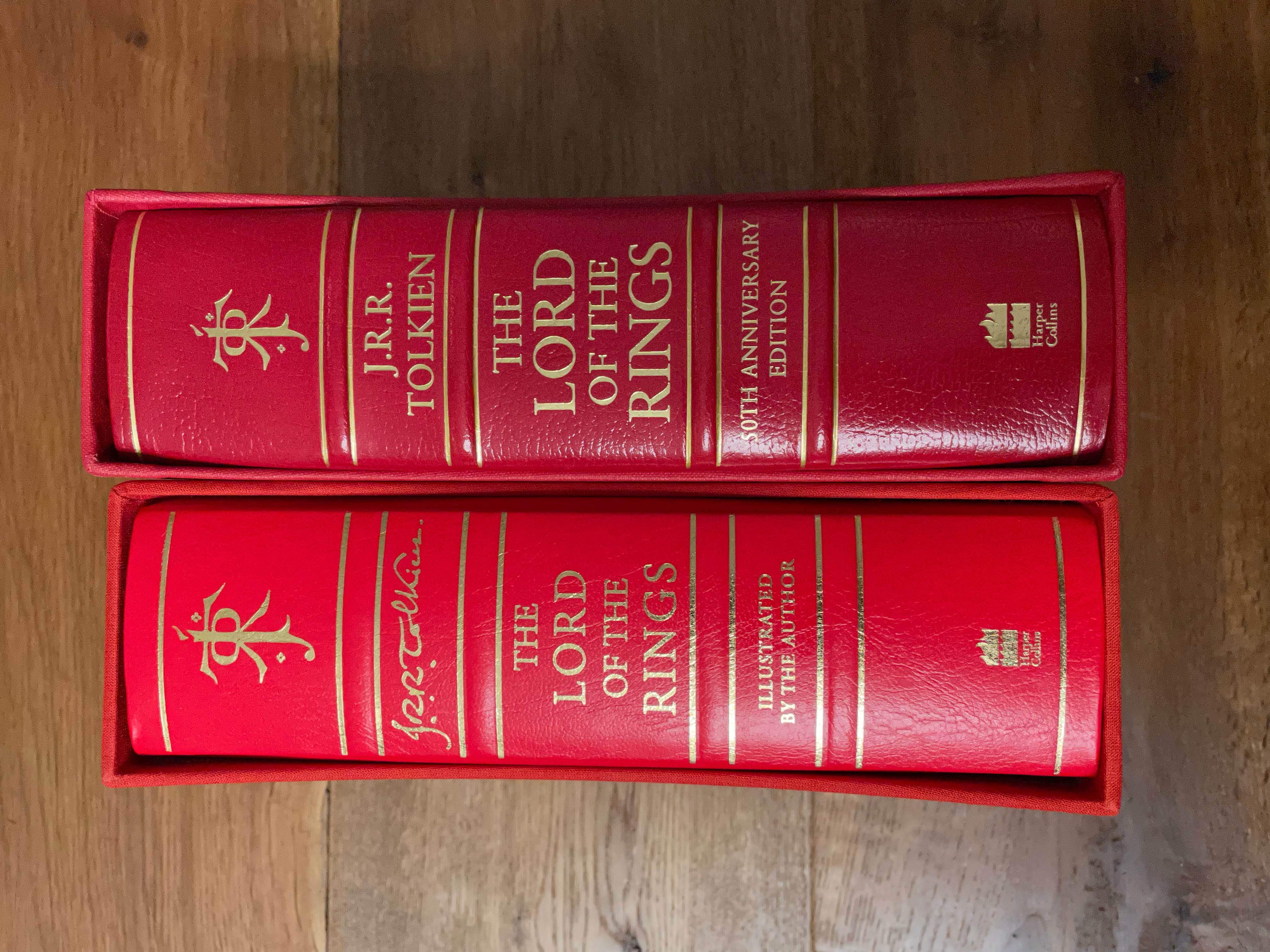
The new book edition is a little bit smaller but thicker than the older one. The used 'leather' is much thinner and looks more like a bonded leather. The red colour is bright and the spine inscription is printed more at the surface of the leather. This book is quarter bound with black cloth.
The contributor's edition uses a thick and darker red morocco leather, inscriptions are printed deeper into the leather and the ribs on the spine are more prominent. It is quarter bound with grey paper covered boards.
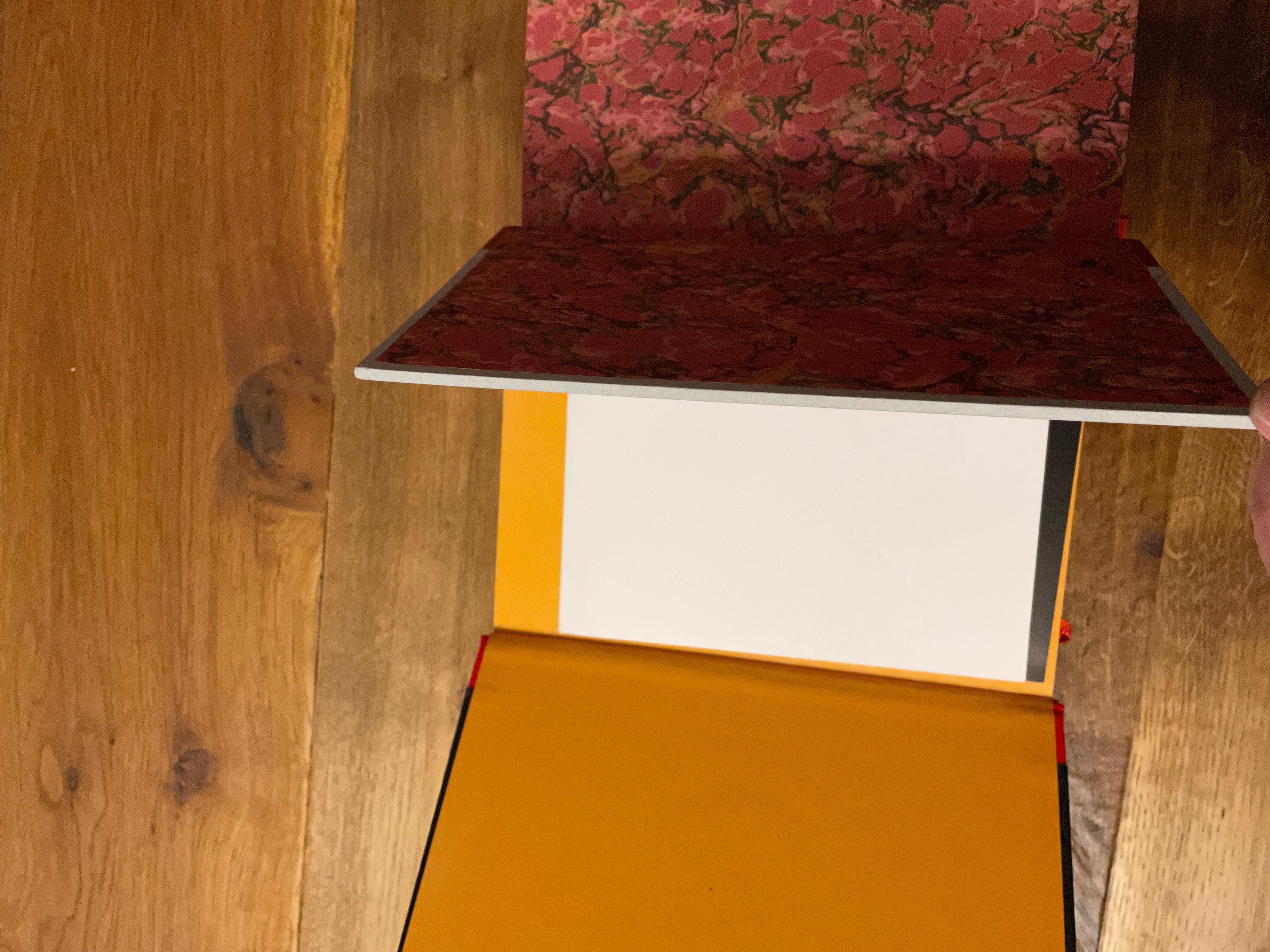
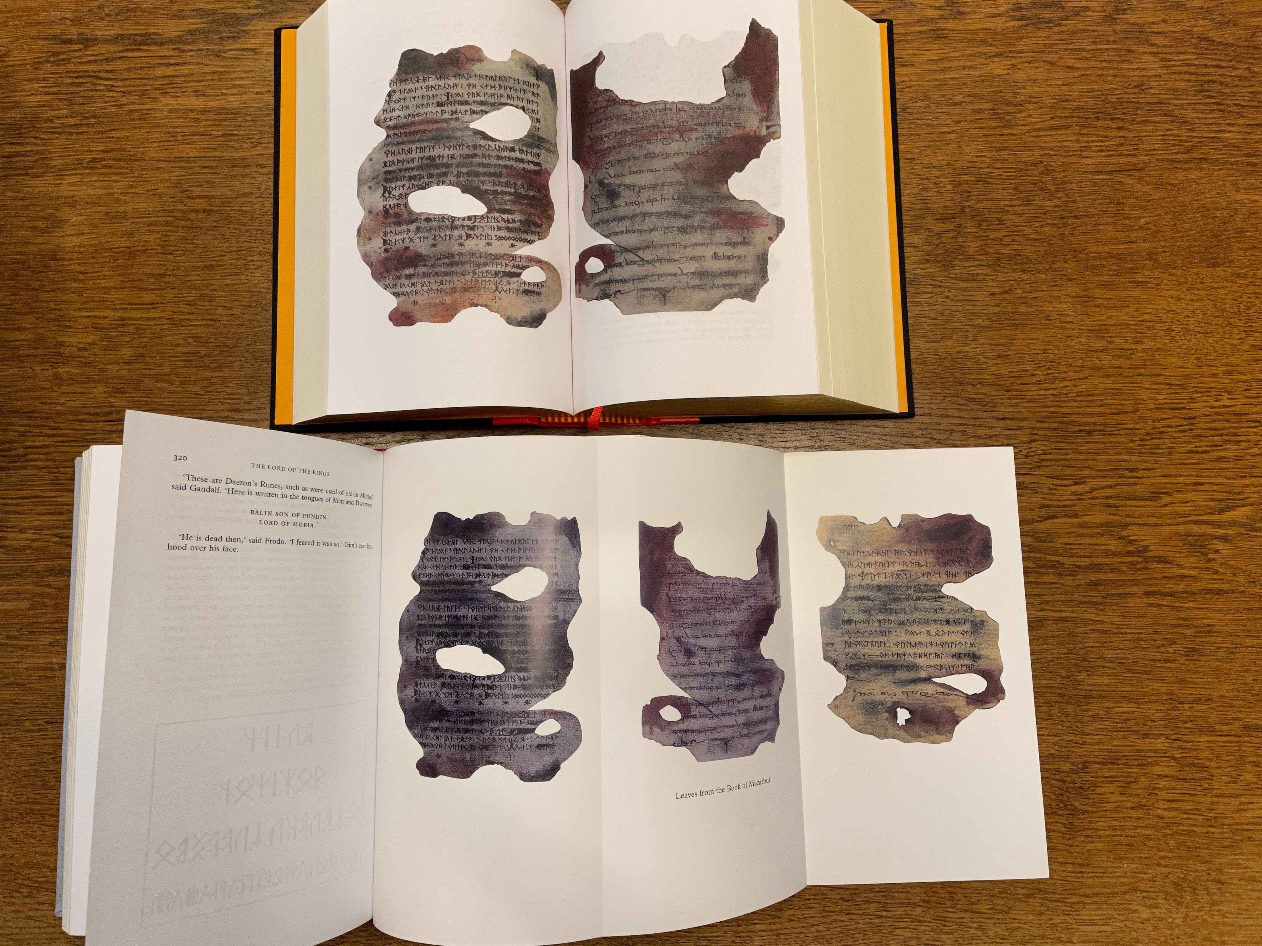
The flyleaves of the Tolkien illustrated edition are made of yellow/orange thin carton paper, in the contributor's edition is used a thick marble paper.
The used paper for the contributor's edition looks more noble, it is smoother and more white. The whole book is printed in black letter colour with the exception of the ring inscription in chapter 2, wich is done in red, and the bicoloured integrated maps.
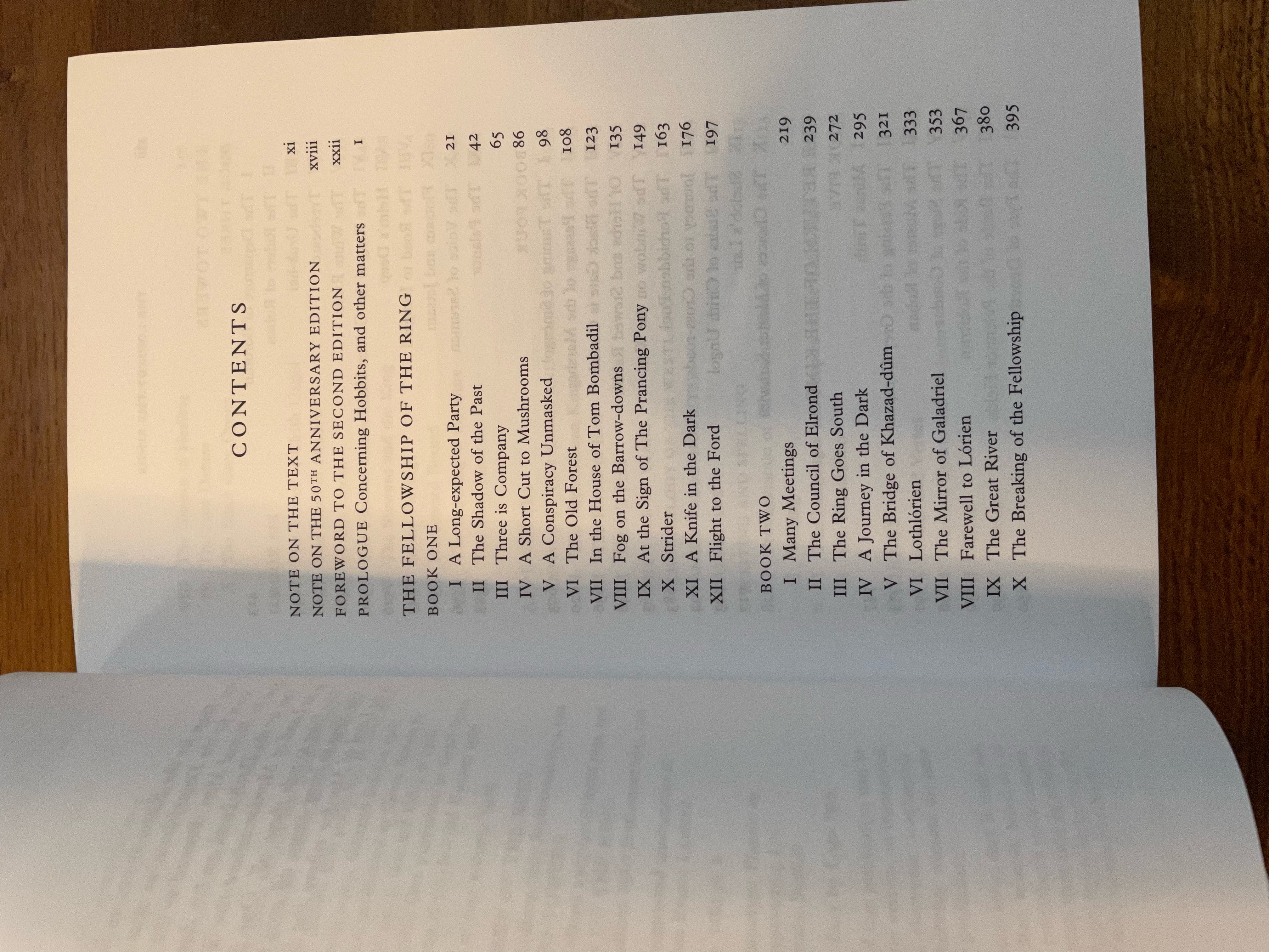
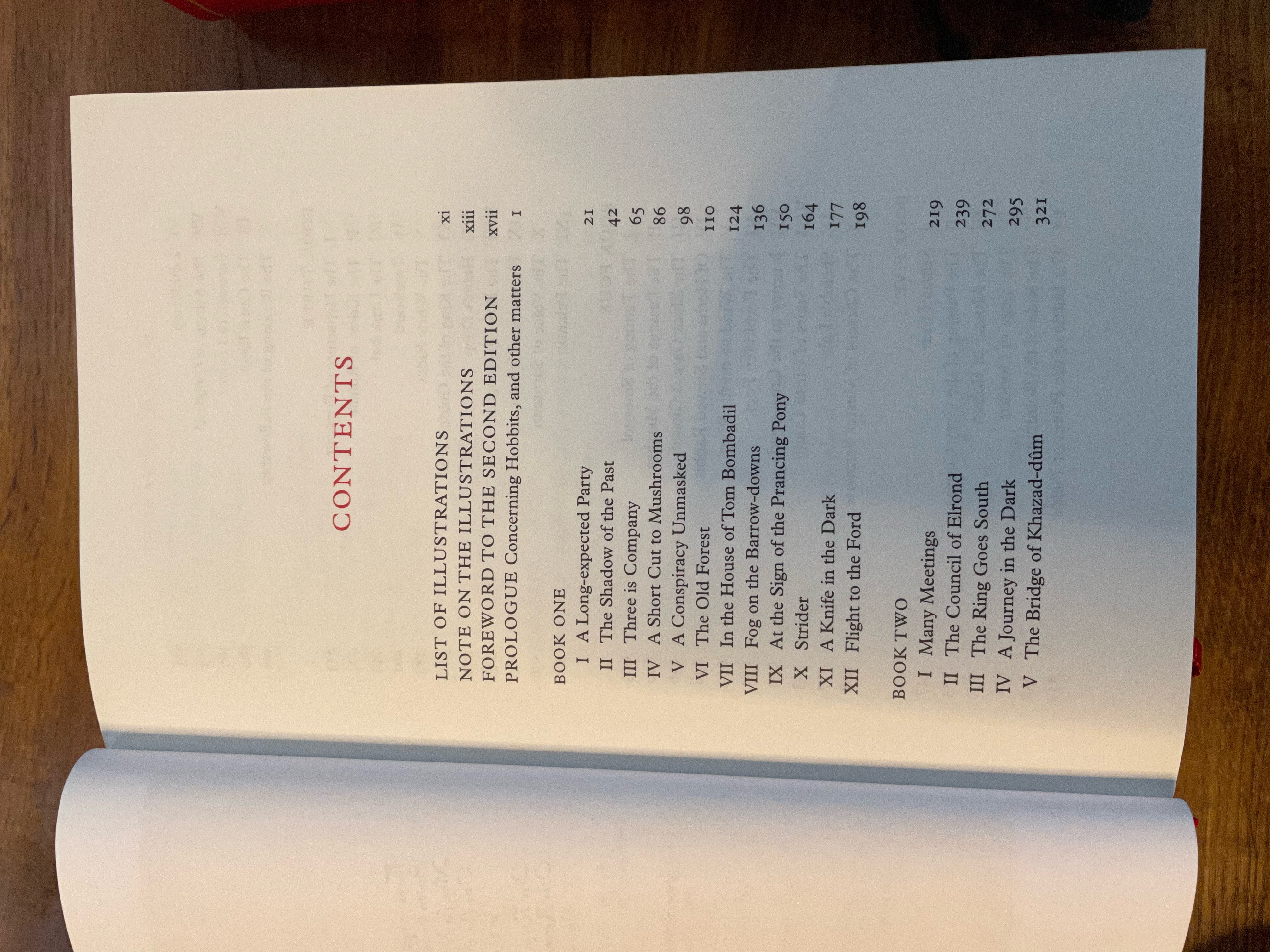
In the contributor's edition it is added the 'Note on the Text' by Doug Anderson and the 'Note on the 50th Anniversary Edition' by Hammond and Scull, but it lacks the 'Note on the Illustrations', and the illustrations as well, with the exception of fold-out pages of the leaves from the book of Mazarbul.
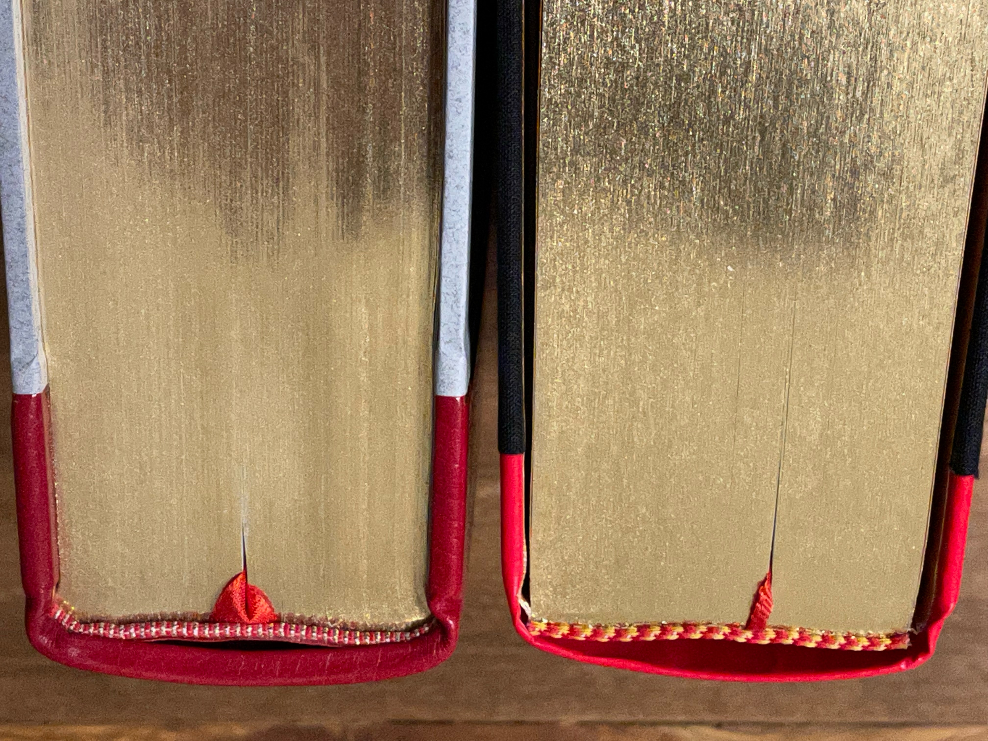
The ribbon marker (important!!!!) is twice as wide with its own structure.
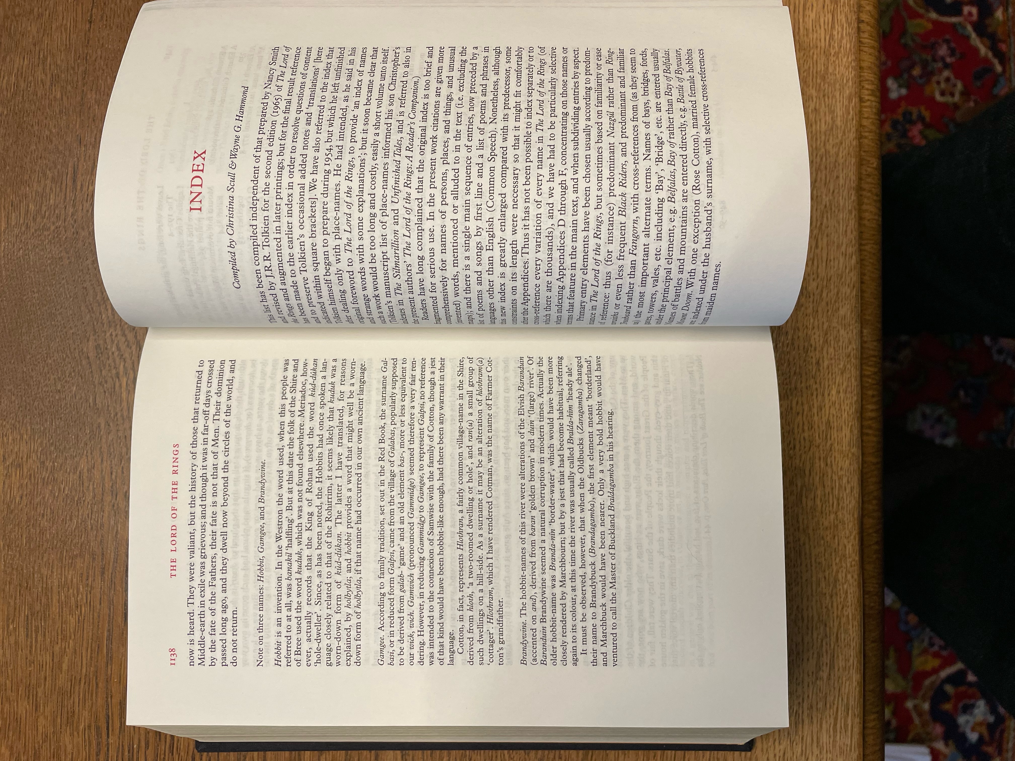
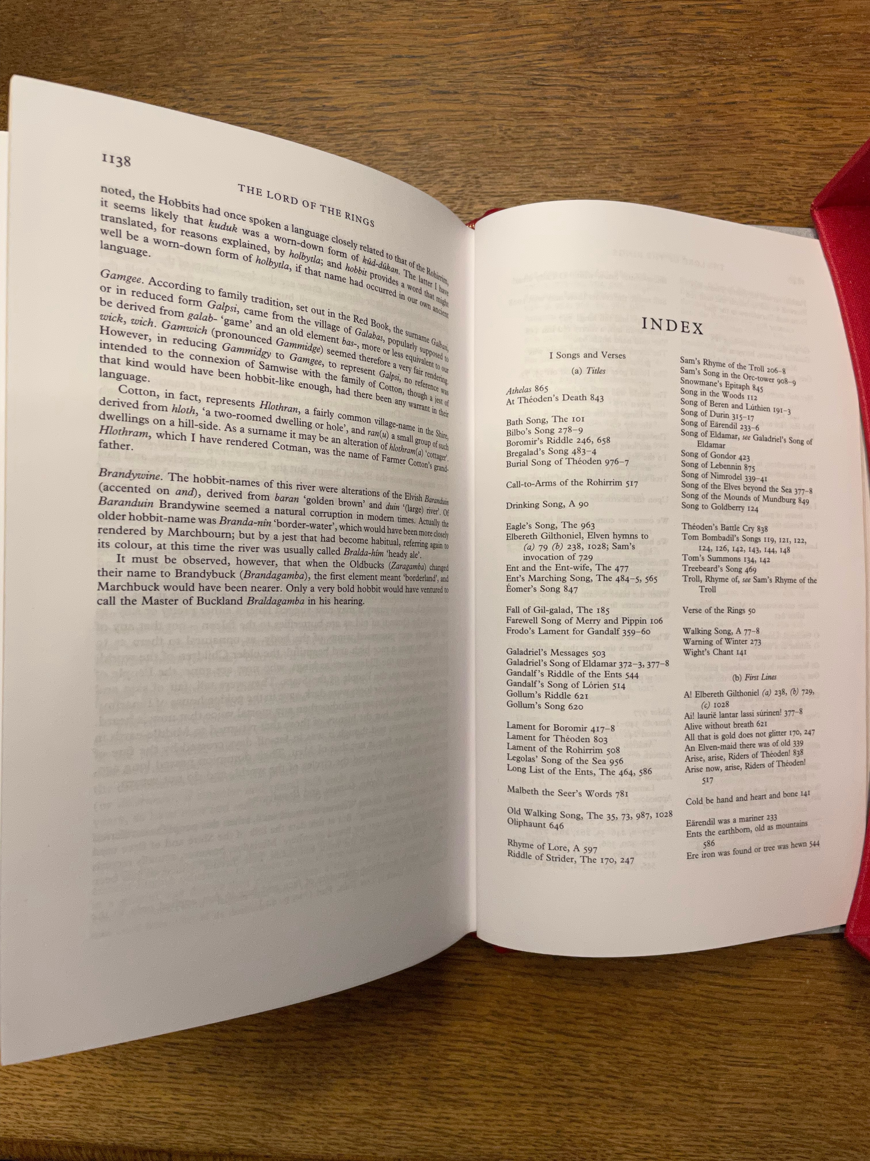
The Index has no foreword.
The maps are much smaller and integrated in the book. There are no added gimmicks like the 'King's Letter' or the facsimiles of the 'Leaves of the Book of Mazarbul'
I've added a bulk of pictures to have a view on both editions.
4779_618e8e47337c0.jpeg 4032X3024 px

4779_618e8e91bf0c1.jpeg 4032X3024 px

4779_618e8f6557855.jpeg 4032X3024 px

4779_618e8f84e5b1d.jpeg 4032X3024 px

4779_618e8fa994c2a.jpeg 4032X3024 px

4779_618e8fbf2d405.jpeg 4032X3024 px

4779_618e8ff28da2c.jpeg 4032X3024 px

4779_618e900aba623.jpeg 4032X3024 px

4779_618e902354b41.jpeg 4032X3024 px

4779_618e9035c9a13.jpeg 4032X3024 px

4779_618e9056658ad.jpeg 4032X3024 px

4779_618e9068212e9.jpeg 3024X4032 px

4779_618e907930a4b.jpeg 4032X3024 px

4779_618e9087ece42.jpeg 4032X3024 px

4779_618e9097264ec.jpeg 4032X3024 px

4779_618e90aa6a7c1.jpeg 4032X3024 px
12 Nov, 2021
2021-11-12 4:45:42 PM UTC
Great pics Ithildin , thanks for this write up. Look at how much thicker the leather is on the Contributor's edition, that's a real super deluxe right there.

Stu no facsimile signatures though
12 Nov, 2021
2021-11-12 4:53:07 PM UTC
Man. I really hate that bright red.
12 Nov, 2021 (edited)
2021-11-12 8:11:15 PM UTC
I'll never understand why they didn't just lift the design in-whole from the 25 copies edition. Sure, the materials didn't need to be as good, but they had a great design with a colour scheme that worked. And then they went with red and black -- two colours that don't go together at all except on gimp suits. I've always found HarperCollins design choices to be "confusing".

Probably design by committee and then the cynical corporate nonsense like the trademarked signature gets thrown into the mix.

That said, they sold 10,000 of them, so what do I know. You have to give them credit for producing something that will shift.

Also, "Those raised spine ribs look great, but a bit expensive to do -- we can just say they have raised spine ribs on the paper insert and hope no one notices! Kerching!!!"
12 Nov, 2021
2021-11-12 9:03:09 PM UTC
Sort of feel Tolkien himself is the one moving these copies. People love his writing, they love his vision, and they especially like to see where the two dovetail in his illustrations–sketchy as some may be. Heck, even the cool bit with the eye was Tolkien's idea. I'd say it's moving despite HC's design efforts.
13 Nov, 2021
2021-11-13 3:01:30 PM UTC
I have to amit that I didn't bother before, but now that I see these two editions side by side, I don't like the signature on the spine at all. Just imagine you were the author of a book and had a free hand in designing the cover/dj. I think it would come across a bit narcissistic if you decided to put your signature everywhere. I join those saying that HC have overdone it this time. I like the signature on e.g. the title page inside, but please, HC, stop replacing every occurrence of the name with it!
14 Nov, 2021
2021-11-14 3:31:54 AM UTC

NoUse wrote:

I have to amit that I didn't bother before, but now that I see these two editions side by side, I don't like the signature on the spine at all. Just imagine you were the author of a book and had a free hand in designing the cover/dj. I think it would come across a bit narcissistic if you decided to put your signature everywhere. I join those saying that HC have overdone it this time. I like the signature on e.g. the title page inside, but please, HC, stop replacing every occurrence of the name with it!

Indeed. This edition is just too gaudy and bordering on ghastly for my taste. It’s like they made it to be as eye catching as possible - with the terrific colour and the bells and whistles all over.

Imo the designers and approvers really need to learn the art of subtlety, or, if they have it, they ought to apply it (constructive criticism! ?).
14 Nov, 2021
2021-11-14 4:30:30 AM UTC

eorl wrote:

NoUse wrote:

I have to amit that I didn't bother before, but now that I see these two editions side by side, I don't like the signature on the spine at all. Just imagine you were the author of a book and had a free hand in designing the cover/dj. I think it would come across a bit narcissistic if you decided to put your signature everywhere. I join those saying that HC have overdone it this time. I like the signature on e.g. the title page inside, but please, HC, stop replacing every occurrence of the name with it!

Indeed. This edition is just too gaudy and bordering on ghastly for my taste. It’s like they made it to be as eye catching as possible - with the terrific colour and the bells and whistles all over.

Imo the designers and approvers really need to learn the art of subtlety, or, if they have it, they ought to apply it (constructive criticism! ?).

The difference between a bad designer and great designer is probably about 5% in terms of skills. Whilst I suspect the HarperCollins designers are not at the top of their game, I suspect they get a lot of constraints about what they need to include. That signature is great example - that isn't being included because the designer thinks it looks good. That is pure corporate shenanigans and it looks like crap because it has been shoehorned in. I find the use of the black cloth with red inexplicable and I can't imagine many designers would have done that with a free canvas to work with. I wonder of they just did it to make it wildly different than the existing deluxe in order to shift more copies to people who already had that edition.

I suspect the SD CoH will always remain the high point for HarperCollins.
14 Nov, 2021
2021-11-14 5:23:22 AM UTC

Stu wrote:

eorl wrote:

NoUse wrote:

I have to amit that I didn't bother before, but now that I see these two editions side by side, I don't like the signature on the spine at all. Just imagine you were the author of a book and had a free hand in designing the cover/dj. I think it would come across a bit narcissistic if you decided to put your signature everywhere. I join those saying that HC have overdone it this time. I like the signature on e.g. the title page inside, but please, HC, stop replacing every occurrence of the name with it!

Indeed. This edition is just too gaudy and bordering on ghastly for my taste. It’s like they made it to be as eye catching as possible - with the terrific colour and the bells and whistles all over.

Imo the designers and approvers really need to learn the art of subtlety, or, if they have it, they ought to apply it (constructive criticism! ?).

The difference between a bad designer and great designer is probably about 5% in terms of skills. Whilst I suspect the HarperCollins designers are not at the top of their game, I suspect they get a lot of constraints about what they need to include. That signature is great example - that isn't being included because the designer thinks it looks good. That is pure corporate shenanigans and it looks like crap because it has been shoehorned in. I find the use of the black cloth with red inexplicable and I can't imagine many designers would have done that with a free canvas to work with. I wonder of they just did it to make it wildly different than the existing deluxe in order to shift more copies to people who already had that edition.

I suspect the SD CoH will always remain the high point for HarperCollins.

I agree Stu.

What you say about designers vs corporate direction makes sense. There’s a big chance some of the design choices were made by people with no knowledge of sensibilities about design aesthetics (for starters, black and tomato red with gold gilt..).

And yes, the super deluxe CoH was really subtle and beautiful. It just has so much presence from being so elegantly simple in its design. I genuinely wish I had the funds to buy it when it was first released.
Jump to Last
All original content ©2024 by the submitting authors. Terms of Use | Privacy Policy | Cookie Policy | Contact Us