Yes that was my plan also. Not collecting all US editions, but only grabbing a few that look really nice.
Thanks for the US Editions site, exactly what I was looking for.
I went over your list:
Thanks for the US Editions site, exactly what I was looking for.
I went over your list:
- LotR 1981 Silver Anniversary Edition - On the fence
- LotR Collectors Edition 1974 - Really like this one
- First Annotated Edition 1988 - IF this is the Hobbit it looks good, there isn't anything comparable in the UK is there?
- Hobbit Collectors Edition 1973 - Very nice
- Hobbit 50th Anniversary Collectors Edition 1987 - Very nice
- Hobbit Eclipse Books 1989, 1990, 1990 - This is interesting a graphic novel of the Hobbit; didn't know they existed. Have to get this too.
- Easton Press Editions - I don't know about Easton Press, don't think their designs are very interesting. Seen these on ebay a lot.
This one I really want but I can't imagine I'll ever buy a book that's so expensive. And it's a rebinding:
Hobbit 1st American Ed
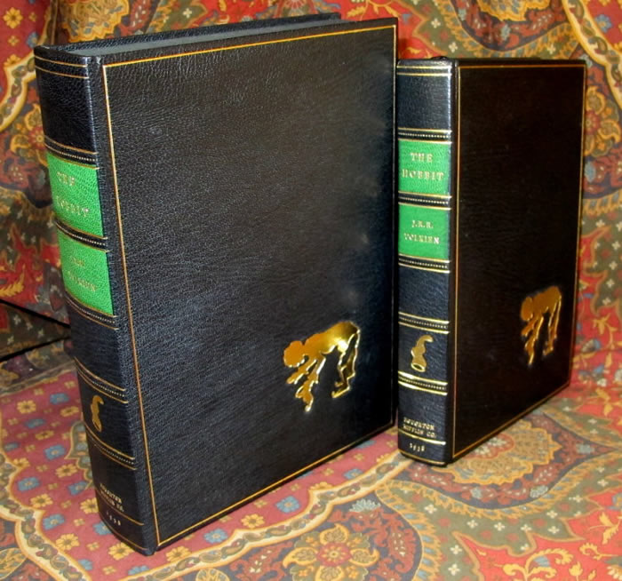
Hobbit 1st American Ed

Actually Doug's Annotated Hobbit is the only UK edition, I have, that I want in a US edition at present --since it was published there first. I see copies, but they're never in the condition I want. Easton Press? --not sure. I have a EP Silmarillion, obviously...
BH
BH
For Easton Press:
Currently only the "Classics" (Hobbit, LOTR, Silmarillion 5 book set) is available from them, though they bring back the other editions occasionally when demand warrants. They are priced at $69 each ($345 for the set of five) including free shipping to the USA.
http://www.eastonpressbooks.com/leather/product.asp?code=0193
They only ship to the USA, so if any of you international TCG folk are interested, please contact me and we can work out an order with me in the middle - just need you to cover CC or PayPal fees and shipping.
I usually see these listed (and selling) on eBay for around $100 each, but if you keep your eyes out you can get most of them for $50 or so.
I have had most of these at one point or another, but have not held on to any copies. They are a reasonable binding and good quality materials, but since there is no limitation (they just keep making more and more with no printing indications) they will never become "scarce" - I figure if I want a nice set, I will still be able to get one ten years from now for the same price, so I use my space for other books.
For a complete list of Easton Press Tolkien books:
https://www.tolkienguide.com/modules/w ... dex.php?page=Easton+Press
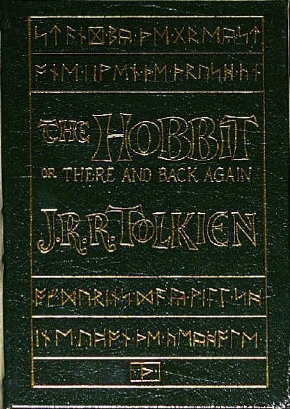
I like Easton Press - the materials are good quality, and they're well put together. But there is something odd about the decoration- it's the same on TH, LotR and Silm, but it's the runic legend 'Stand by the grey stone when the thrush knocks' which really only applies to TH.
There's an error with one of the runes, too.
There's an error with one of the runes, too.
Can you say a little more about this error? I have to confess I'm not a Tolkien rune expert, but if they are selling these books all these years with an error on the cover it would find it funny (I have a sick sense of humor)

7 Oct, 2011
(edited)
2011-10-7 9:02:05 PM UTC
Edited by Urul�k� on 2011-10-7 9:21:54 PM UTC
Edited by Urul�k� on 2011-10-7 9:22:24 PM UTC
Edited by Urul�k� on 2011-10-7 9:24:38 PM UTC
Edited by Urul�k� on 2011-10-7 9:32:51 PM UTC
Edited by Urul�k� on 2011-10-7 9:39:24 PM UTC
Edited by Urul�k� on 2011-10-7 9:40:44 PM UTC
Edited by Urul�k� on 2011-10-7 9:22:24 PM UTC
Edited by Urul�k� on 2011-10-7 9:24:38 PM UTC
Edited by Urul�k� on 2011-10-7 9:32:51 PM UTC
Edited by Urul�k� on 2011-10-7 9:39:24 PM UTC
Edited by Urul�k� on 2011-10-7 9:40:44 PM UTC
2011-10-7 9:02:05 PM UTC
On quality - I agree that these are really well made - good quality leather, Smyth-sewn, 22kt gilt and accents.
Also, one thing I neglected to mention in the guide page (updated now) is that the maps are laid-in rather than tipped-in. In other words, this is one of the few editions where the maps are not attached, so you can easily remove them while reading (or lose them, so beware when buying used).
For the rune error, here is a good post on the topic:
http://eastonpress.blogspot.com/2011/ ... ng-book-by-its-cover.html
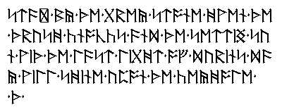
Here is an image of the runes as they should be (working away from books, sorry this is dragging out - please correct me if I am wrong!)
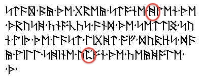
It looks like the fourth rune on the second line of the Easton Hobbit is wrong - it should look like a capital H with two horizontal bars, but instead is just two vertical bars. Also, the fifth rune on the fourth line on the Easton Hobbit is drawn as the prior one should have been, when instead it should look like a capital C.
And one more edit/note: the rune on the bottom of the book in the box ("Th" with dots) is the signature of Thrain (the map has that rune twice, one for Thror and Thrain, the creators of the map, plus the second moon runes added by Thrain and discussed here).
Also, one thing I neglected to mention in the guide page (updated now) is that the maps are laid-in rather than tipped-in. In other words, this is one of the few editions where the maps are not attached, so you can easily remove them while reading (or lose them, so beware when buying used).
For the rune error, here is a good post on the topic:
http://eastonpress.blogspot.com/2011/ ... ng-book-by-its-cover.html
"Stand by the grey stone when the thrush kn" and the bottom set reads "Of Durin's day will shine upon the keyhole". The same set of runes top and bottom appear on the back cover. I'm pleased that Easton decided to incorporate the dwarven runes into their cover design, but it is unfortunate that they chose a long piece of text and had to cut the middle out of it. For those who are curious, the full text that they are quoting is "Stand by the grey stone when the thrush knocks and the setting sun with the light of Durin's day will shine upon the keyhole". Its a line that is pretty integral to the plot but its too bad that it got cut in the middle, perhaps they could have had it continue on to the back so the whole phrase would fit or use the other shorter dwarven quote from the map, "Five feet high the door and three may walk abreast - Th. Th." This would likely have fit on the cover and could have been repeated on the back. At the bottom of the cover is a rune resembling the "Th" rune with two dots on other sides surrounded by a box. I do not recognise this rune and if anyone has any insight into what this represents please let me know in the comments.

Here is an image of the runes as they should be (working away from books, sorry this is dragging out - please correct me if I am wrong!)

It looks like the fourth rune on the second line of the Easton Hobbit is wrong - it should look like a capital H with two horizontal bars, but instead is just two vertical bars. Also, the fifth rune on the fourth line on the Easton Hobbit is drawn as the prior one should have been, when instead it should look like a capital C.

And one more edit/note: the rune on the bottom of the book in the box ("Th" with dots) is the signature of Thrain (the map has that rune twice, one for Thror and Thrain, the creators of the map, plus the second moon runes added by Thrain and discussed here).
Ah, that's not the one I meant. The one I mean occurs on the second line down on the cover of the book; fourth rune from the left. It's meant to look like a capital 'H', with two slanting crossbars, but the crossbars are missing, leaving two vertical lines resembling two capital 'I's.
It's just an odd thing...
It's just an odd thing...





 3536
3536 1393706