Print issue of the two-color Shire map
9 Apr, 2024
(edited)
2024-4-9 3:39:50 AM UTC
2024-4-9 3:39:50 AM UTC
I notice the standard two-color map of Shire appears to have print issues in most hardcover editions. Unique misalignment of the two colors can be found in different impressions of 1st edition.
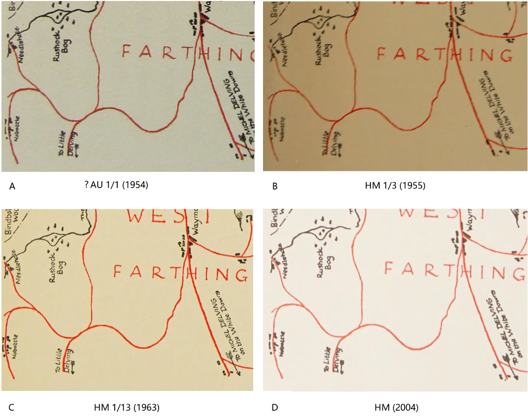
A is taken from Art of The Lord of the Rings, which doesn't specify the impression, but I guess it is likely UK 1st impression. B and C are respectively from 3rd and 13th impressions of US first edition. D is from the 50th anniversary edition. It appears none has a prefect match. The misalignment can also be observed in greyscale maps.
I have no idea of the pre-digital multi color printing technology, would the misalignment remain the same for one impression and state (if so it could be an good tool to identify impressions of HM 1st edition), or could it vary within the same batch (then every copy is sort of unique)? It appears they switched to digital printing in 1994, and the map in every copy is identical since then (I compared three copies printed in 2004, 2021 and 2022).
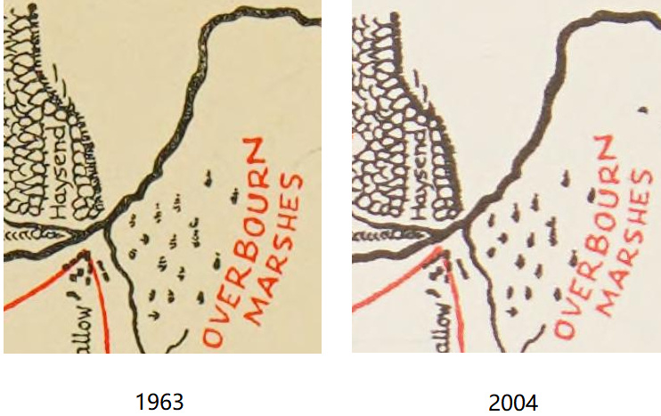
You can also note the map in the current edition has heavier lines than in the 1st edition, thus losing many details (the same thing happens to all plates in most post-1994 LR editions), and there is a damage in The Water below Rushock Bog, a blot in the southeast of Overbourn Marshes. Some features are also found in the greyscale Shire map from editions in the 1970s, so I guess they might be introduced since the 2nd edition in 1966, could someone check that?

A is taken from Art of The Lord of the Rings, which doesn't specify the impression, but I guess it is likely UK 1st impression. B and C are respectively from 3rd and 13th impressions of US first edition. D is from the 50th anniversary edition. It appears none has a prefect match. The misalignment can also be observed in greyscale maps.
I have no idea of the pre-digital multi color printing technology, would the misalignment remain the same for one impression and state (if so it could be an good tool to identify impressions of HM 1st edition), or could it vary within the same batch (then every copy is sort of unique)? It appears they switched to digital printing in 1994, and the map in every copy is identical since then (I compared three copies printed in 2004, 2021 and 2022).

You can also note the map in the current edition has heavier lines than in the 1st edition, thus losing many details (the same thing happens to all plates in most post-1994 LR editions), and there is a damage in The Water below Rushock Bog, a blot in the southeast of Overbourn Marshes. Some features are also found in the greyscale Shire map from editions in the 1970s, so I guess they might be introduced since the 2nd edition in 1966, could someone check that?





 34
34 25.44K