


Eorl wrote:
I did not notice that difference on the spine gilt colouring. But in a way it looks Christmassy because of it. So I agree with Uruloke that this change I am fine with.
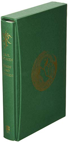
My biggest disappoint has got to be the HoME series in this format. Goodness you can’t even say it is part of this series because there are more differences than similarities ?
Not super-keen in the icicles on the slipcase (feels a bit "buttering the bacon" with the seasonality), but otherwise looks better than expected. Nice to see them putting a bit more effort in than usual.
Interesting that the HC logo is white, not silver - That will prob stand out more than the gold/silver gilt difference.

Looks lie pretty nice. I like how it's a "Christmas-ized" version of the deluxe edition format. For instance: the icicles, the silver and white lettering, the silver ribbon-marker, etc. Also given the style of the slipcase, it looks like it'll fit, height-wise, with the other titles (The Facsimile Hobbit (book from 2016, and the gift set from 2017), The Lord of the Rings 60th anniversary illustrated edition, and the deluxe edition of Jemima Catlin's Hobbit don't go with the rest of the deluxes, in terms of height. (Also, it'd be nice if The History of Middle-earth deluxe set matched in design closer to the deluxes than it currently does.)
It is highly unlikely that I'll get this edition though: the paperback (my edition says 2015 on the copyright page, but the release date on some retailers says 2009...) edition will do me just fine :) Though I'd love to get the audio CD narrated by Jacobi.
This looks to be the finalized or definitive edition as it'll have everything related to Tolkien writing as father Christmas that he ever made, as well as it'll combine all prior releases into one set. I do not believe that the art will be removable though - could be wrong.
I'm also curious which image will be used as the foldout fronstispiece they mention: "...and a special full-colour, foldout frontispiece." I think it’ll be two images side by side: “Dressed for the Snow and the Cold” with ‘my house’ (sometimes as one image, but two “panels"). If those are next to each other, than those as the frontispiece could easily be foldout.
I've gone ahead and pre-ordered a copy. It does look more like the level of effort that was put into the original Hobbit and LoTR "deluxes".
I still hope it it is the last, though!
I still hope it it is the last, though!

")

Stu, I’m pretty sure they will do Mr. Bliss in a similar format, and probably “cutefy” it like the addition of the icicles on the slipcase and what seem to be snowflakes or something on the cover of this one.
I just glad they used a nice motif on the slipcase - although it isn’t gilt embossed, it still fits in with the rest of the series. As you said, you can see they put in some thought and effort (unlike with the HoME books).
I just glad they used a nice motif on the slipcase - although it isn’t gilt embossed, it still fits in with the rest of the series. As you said, you can see they put in some thought and effort (unlike with the HoME books).
With The History of Middle-earth, I expected it to be very similar to the 'standard' three-part omnibus editions. The only thing I can see that they should have done, was made the opening of the slipcase (and the spines of the books....?) have that "curve" that the rest of the deluxes have.
That aside, I've come to notice, that 90% of the time, a deluxe edition and a standard hardback feature the exact same content. One's just a bit more high end. The only thing I could see them possibly adding, would be the John Howe images from the paperback editions as frontispieces to each of the 12 books (spread over 3 physical books) on "photo paper."
That aside, I've come to notice, that 90% of the time, a deluxe edition and a standard hardback feature the exact same content. One's just a bit more high end. The only thing I could see them possibly adding, would be the John Howe images from the paperback editions as frontispieces to each of the 12 books (spread over 3 physical books) on "photo paper."
insurrbution wrote:
With The History of Middle-earth, I expected it to be very similar to the 'standard' three-part omnibus editions. The only thing I can see that they should have done, was made the opening of the slipcase (and the spines of the books....?) have that "curve" that the rest of the deluxes have.
That aside, I've come to notice, that 90% of the time, a deluxe edition and a standard hardback feature the exact same content. One's just a bit more high end. The only thing I could see them possibly adding, would be the John Howe images from the paperback editions as frontispieces to each of the 12 books (spread over 3 physical books) on "photo paper."
The main problems with the HoME deluxe (other than the first 230-odd copies being super-low quality in a slipcase that did not match the height of the other books) was that the spines were not revised to match the existing deluxe editions and individual slipcases were not used.
My understanding was that they did not expect to sell many copies, and this was the very last edition (of anything) from HarperCollins to be printed by Clays. I think it was just done quick-and-dirty.
When it sold out, they could and should have re-worked the spines when transferring the printing duties to LEGO. I don't really understand why they didn't rework the later prints, as it seems like it would be very low-effort. At least with the LEGO prints, the height is correct though, so they don't look totally mismatching.
"was that the spines were not revised to match the existing deluxe editions and individual slipcases were not used."
That part I knew of.
Do you have a favourite of the deluxe editions?
That part I knew of.
Do you have a favourite of the deluxe editions?
Urulókë wrote:
I hoped you would cave. Collecting is a bit like Hotel California. ?
You know me - I always fold

Eorl wrote:
Stu, I’m pretty sure they will do Mr. Bliss in a similar format, and probably “cutefy” it like the addition of the icicles on the slipcase and what seem to be snowflakes or something on the cover of this one.
I just glad they used a nice motif on the slipcase - although it isn’t gilt embossed, it still fits in with the rest of the series. As you said, you can see they put in some thought and effort (unlike with the HoME books).
Yeah, I think a Mr Bliss would almost be a given if this sells well, tbh.

 84
84